On this Page
| Table of Contents | ||||
|---|---|---|---|---|
|
Overview
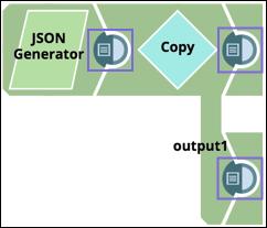
Data Preview displays a sample of the data being passed through the Pipeline per Snap in two views: tabular and visual. When you create and save a Pipeline, you can preview some of the data that a Snap passes down the Pipeline by clicking on the data preview icon in the connector.
If you want to disconnect the Snaps instead of displaying the data preview, position the cursor over the connection from the adjoining Snap.
Data Preview Guidelines
- All subsequent data previews down the Pipeline work only with that initial preview data set, so your actual resulting data may vary from what you see in the preview data.
- JavaScript has a limit on the number of digits displayed for an integer. While the actual value is maintained in the data, the preview data of big integers may round at 16 digits.
- Preview data is encrypted before it is stored for use in SnapLogic.
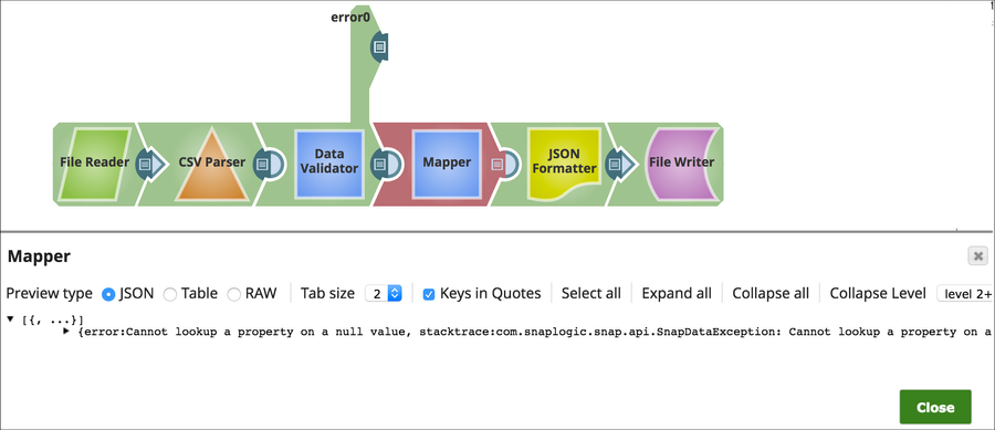
- When Snaps do not execute, you can still preview error documents:
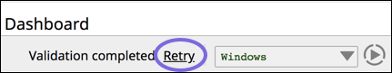
- Your browser caches your preview results. If you are finding your preview data is not exactly what you are expecting, click Retry next to validation.
- If data preview does not display, check the User Settings. If the Snaps still do not display the Data Preview, check with your administrator to see if Pipeline Validation has been disabled at the Org level.
Selecting the Number of Records for Preview
You can change the number of records to be previewed throughout the Snaps in your Pipeline. The default setting is 50 records. Depending on the Pipeline, you might want to increase the number of records for a more accurate visualization of the data set.
To change the number of records:
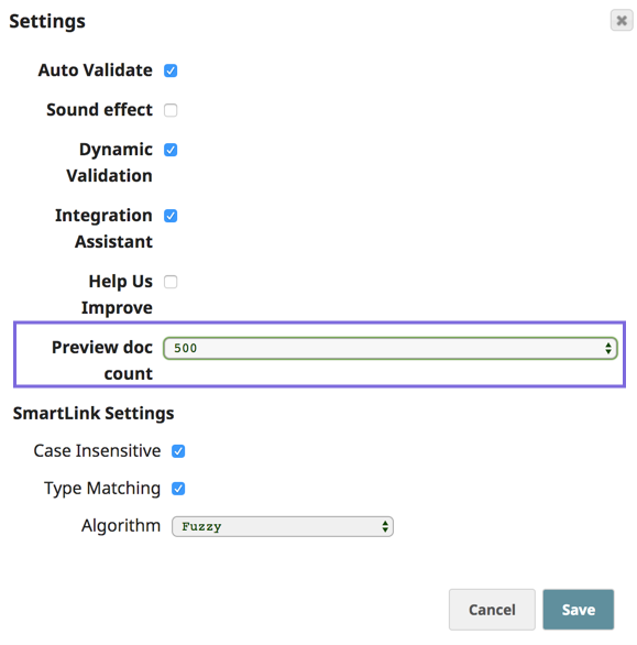
- In SnapLogic Designer, click the User Settings icon on the Toolbar at top to display the Setting dialog:

- In the Settings dialog, click the Preview doc count drop-down menu, select the number of records (50, 100, 200, 500, 1500, 2000), then click Save.
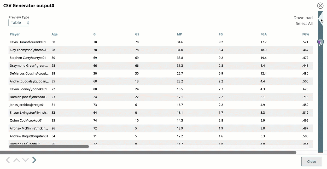
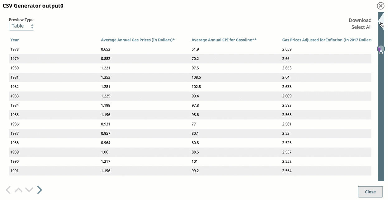
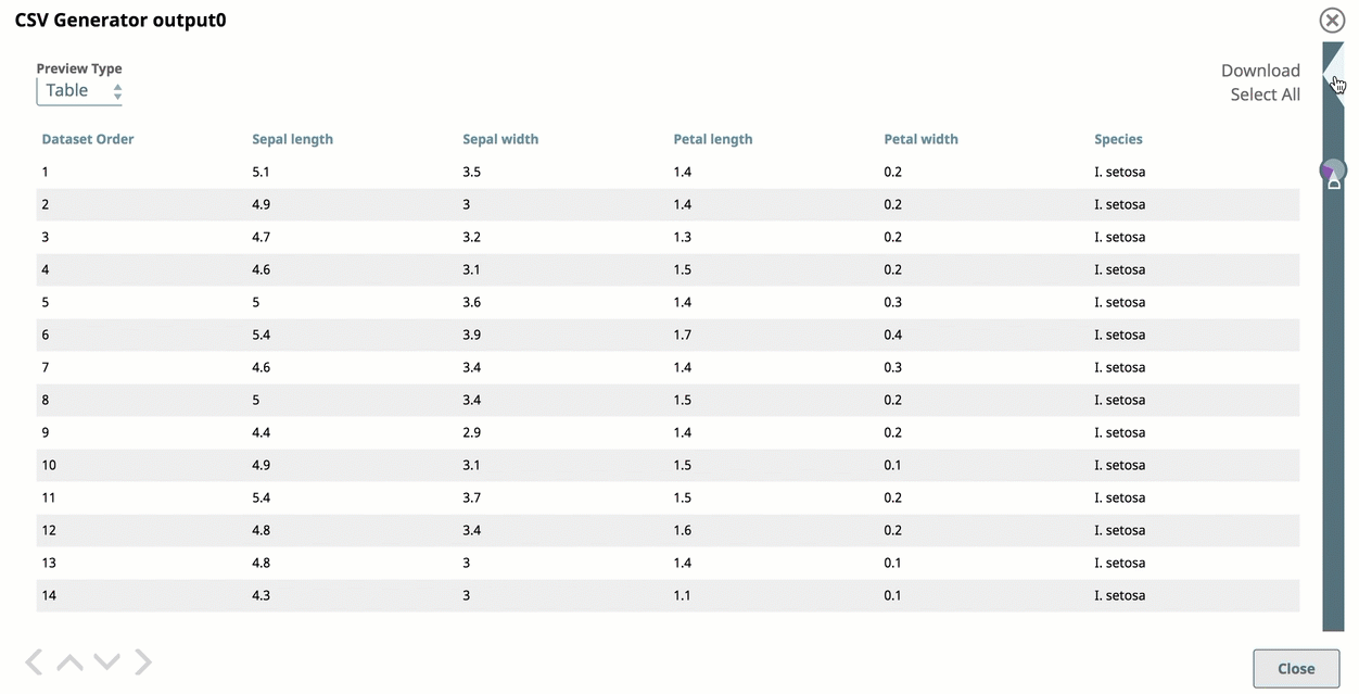
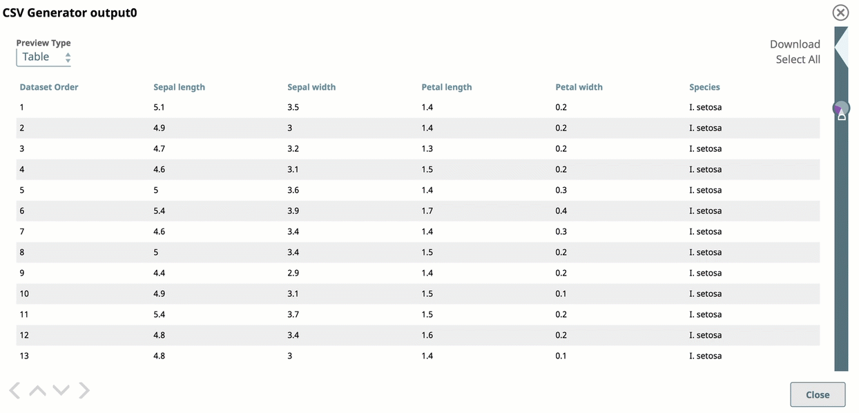
Tabular View
You can view your data arranged in a standard table with infinite scrolling capabilities. As you scroll further past the first set of displayed rows, more data is uploaded.
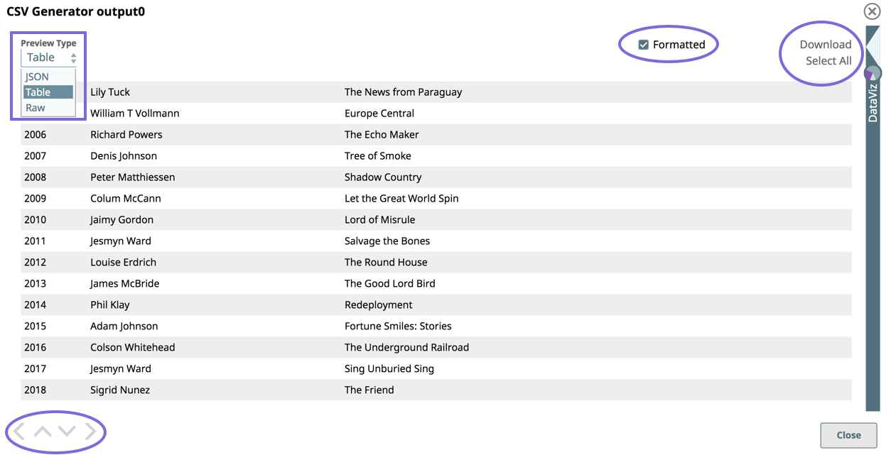
Preview Type: Select the Preview Type as JSON, Table, or Raw to view the data in JSON format, as a Table (default), or as Raw Data.
Navigation: Click the inner arrow keys to navigate through the records, and click the outer arrow keys to navigate through the Data Preview of each Snap in the Pipeline.
Formatted: Select to format document data with line-feeds. Doing so increases the readability of the data in table/JSON modes. For example, when viewing error documents that have a stack trace column in JSON/table mode, you can select Formatted to view this information easier.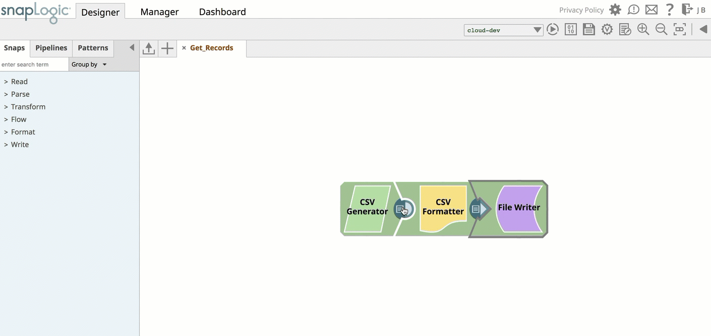
Download: Click Select All and Download to download the entire data set as a JSON file.
Data Visualization
To display Data Visualization, click DataViz and drag the cursor to slide to the left, and the chart tool opens on the right side. Alternatively, you can click on the triangle at the top of the DataViz bar to display the graph.
The visualization is of all the records in the document, as opposed to the limited records that the tabular view provides. You can click Chart Type to select the following types:
- Pie chart
- Line chart
- Line Chart - Date as X Axis
- Bar Chart - Group and Count
- Bar chart - Count
- Scatter chart
| Note |
|---|
The visualization in the new Data Previewer does not work if you open the previewer before the Pipeline validation is complete. |
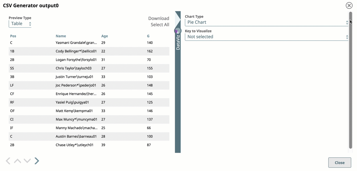
Pie Chart
A Pie Chart is an effective representation for visualizing data in sectors, where each sector represents a group proportionately to the whole.
To display your data in a Pie Chart:
- Select Pie Chart as the Chart Type
Select the Visualization Key menu and choose a data category.
| Note | ||
|---|---|---|
| ||
We do not recommend selecting values for Pie Chart visualization where the variety of individual values proves too numerous to render a meaningful graph. Doing so may cause the Pie Chart to fail to render. The Pie Chart is intended to illustrate patterns where values can be grouped by category. For example, selecting a Store Location value, where only 50 stores exist, makes a meaningful pie chart visualization; however, selecting a date value over three years of transaction records, would result in an too many dates for the Pie Chart visualization to render the chart correctly. |
Line Chart
A Line Chart is an effective representation to compare trends visually across multiple categories of data in a given state or time; it plots a series of data points connected by a line.
To display your data in a line chart:
- Select Line Chart as the Chart Type.
- Select Keys to Visualize.
Line Chart - Date as X Axis
A Line Chart is an effective representation to compare trends visually across multiple categories of data in a given state or time; it plots a series of data points connected by a line.
To display your data in a line chart with date as the x-axis:
- Select Line Chart as X axis as the Chart Type.
- Select a temporal category (year, date, or time) for the X-axis (date).
- Select data categories for Key to Visualize.
Bar Chart - Group and Count
A bar chart is an effective representation for comparing data sets across two categories against an indexical data category, such as time or geographical location.
To display your data in a bar chart by group and count:
- Select Bar Chart as the Chart Type.
- Select a data category from Category.
- Select a data category from Group by.
You can click each line for a range of the values per each category for the indexical relationship between the group key value and the number of entries for that value.
Bar Chart - Count
A simple bar chart is an effective representation for counting the number of instances within a category in a data set, similar to a pie chart.
To display your data in a bar chart:
- Select Bar Chart - Count as the Chart Type.
- Select a data category from Key to Visualize
Scatter Chart
A scatter chart is effective for visualizing your data set as a map of coordinates across three categories; it uses color-coding and shapes to help you easily discern the data categories that the coordinates represent.
To display your data in a scatter chart:
- Select Scatter Chart as the Chart Type.
- Select a data category from the X-Axis and Y-axis drop-down menus.
Select a data category from the Group By menu.
In addition, you can click a data point to view its values. The data points are plotted by Group Key, so that its value is the header, and the X- and Y- axis values appear below, separated by a comma.