| Table of Contents |
|---|
Overview
The Insights dashboard offers interactive charts that help you visualize Org-level Pipeline-execution statistics for a specific date range. The Insights dashboard also displays data visualization of assets that are used in your Org for a specific period.
You can customize the dashboard to only display the information that you need. You can also download CSV files of all the statistics.
| Note |
|---|
|
...
To view the Insights dashboard, click Dashboard > Insights. By default, SnapLogic displays data for a week.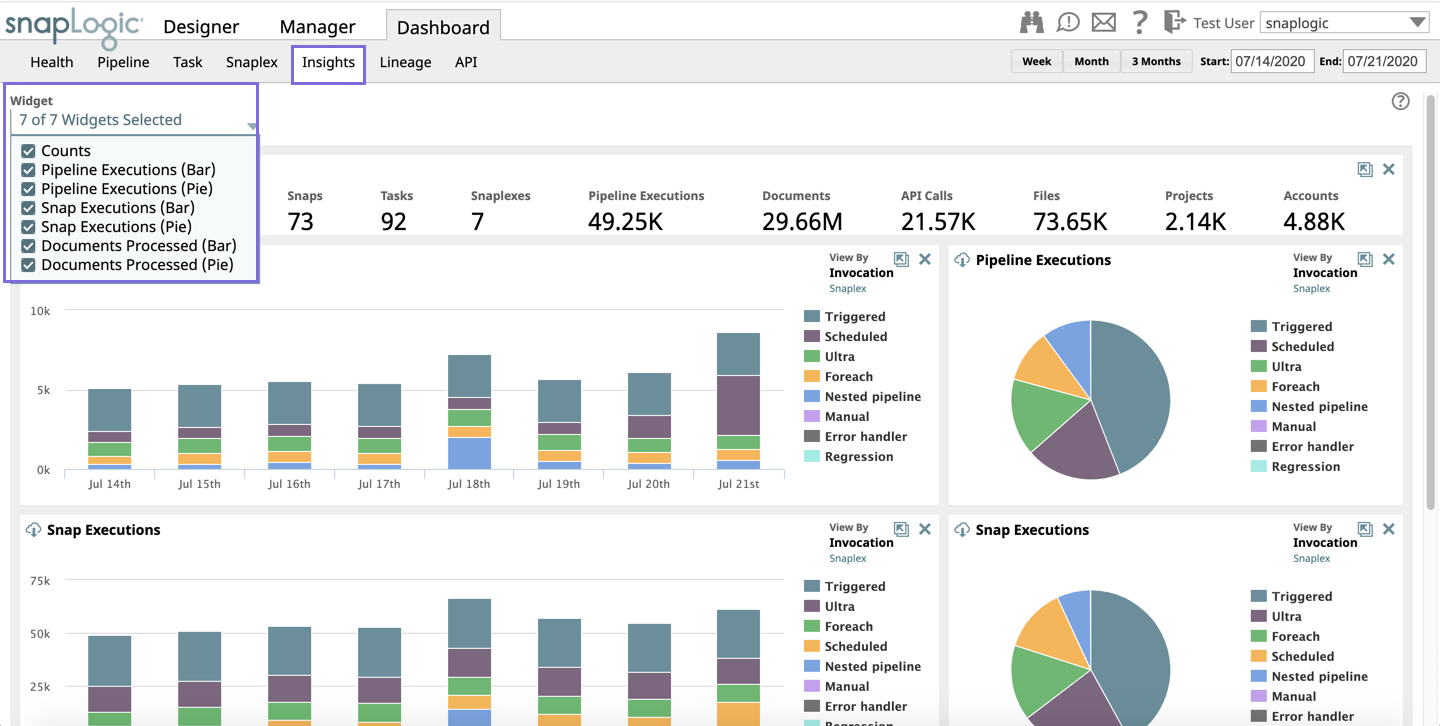
The dashboard displays bar and/or pie charts for the following:
- Pipeline Executions: The number of Pipelines that have been executed Pipelines executed in your Org during the specified window of time.
- Snap Executions: The number of Snaps that have been executed in your Org during the specified window of time.
- Documents Processed: The total number of documents that have been processed by the Snaps in Pipelines.
- Bytes per Snap: The number of bytes that have been processed by each Snap type in your Org.
The Counts panel displays the total count of Pipelines, Users (that are logged in during the specified window of time), Snaps, Tasks, Snaplexes (that are active during the specified window of time), Pipeline Executions, Documents, API calls, Files, Projects, and Accounts associated with your Org.
| Info |
|---|
|

...
For a Snaplex, the dashboard displays the statistics for all the Snaplex instances in your Org.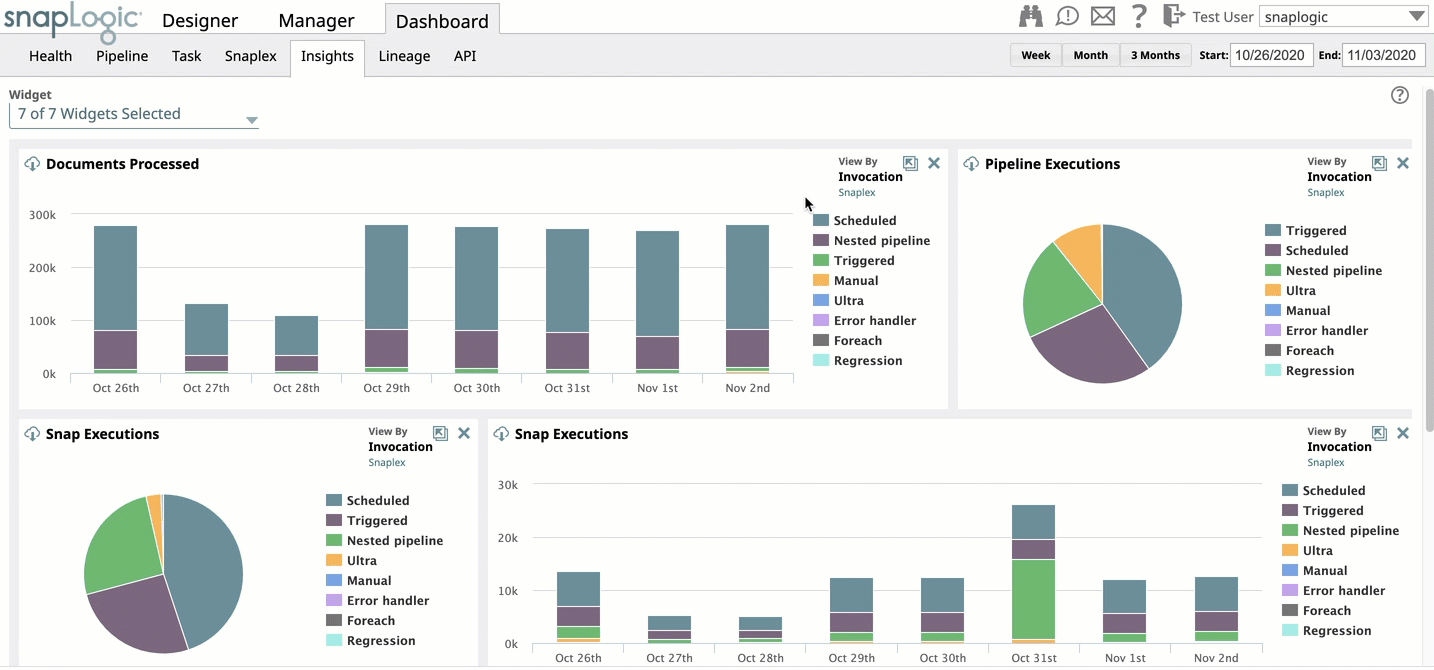
Viewing details of selected dimensions
For each chart, you can select or deselect the dimensions that the chart displays. For example, in Pipeline Executions chart and Invocation Type view, you can select or deselect one or more dimensions like Scheduled, Foreach, Nested Pipelines. The statistics are displayed only for the selected dimensions.
To remove a dimension, click on the dimension name next to the chart. The dimension name is disabled and the chart only displays statistics for the rest of the dimensions.
...