...
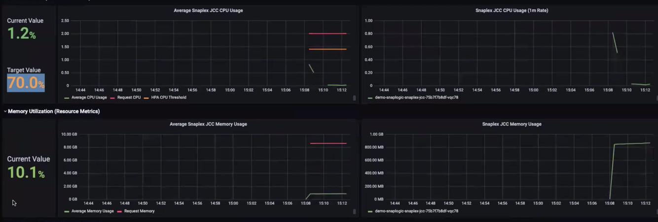
In the graph, the color coding for the lines in the chart lines indicates the following:
- Geen—Average Green—Zone of Average CPU Usage
- Red—Requested CPU Resources
- Orange—HPA Orange—Zone of HPA Metric Threshold (see other charts in this article)
...