On this Page
...
Open Data Preview for a Snap.
Click the triangle at the top of the DataViz bar.
For Chart Type, select Pie Chart.
Click Key to Visualize and choose the key for the values to represent in a pie chart.

| Anchor | ||||
|---|---|---|---|---|
|
...
Open Data Preview for a Snap.
Click the triangle at the top of the DataViz bar.
For Chart Type, select Line Chart.
Click Key to Visualize.
For each line, select a numeric field key.

| Anchor | ||||
|---|---|---|---|---|
|
...
Open Data Preview for a Snap.
Click the triangle at the top of the DataViz bar.
For Chart Type, select Line Chart - Date as X axis.
For X-axis (date), select a temporal field (year, date, or time).
Click Key to Visualize.
Select the key for the y-axis values.

| Anchor | ||||
|---|---|---|---|---|
|
...
Open Data Preview for a Snap.
Click the triangle at the top of the DataViz bar.
For Chart Type, select Bar Chart - Count.
Click Key to Visualize.
Select the key field for the y-axis.

| Anchor | ||||
|---|---|---|---|---|
|
...
Open Data Preview for a Snap.
Click the triangle at the top of the DataViz bar.
For Chart Type, select Bar Chart - Group and Count.
For Category, select the target type.
For Group by, select the field to aggregate.
Roll your cursor over the bars to display a range of the values per each category for the indexical relationship between the group key value and the number of entries for that value.

| Anchor | ||||
|---|---|---|---|---|
|
...
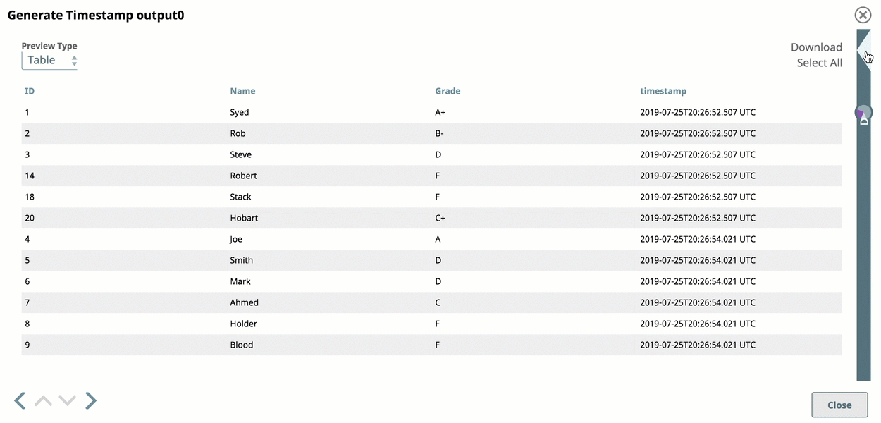
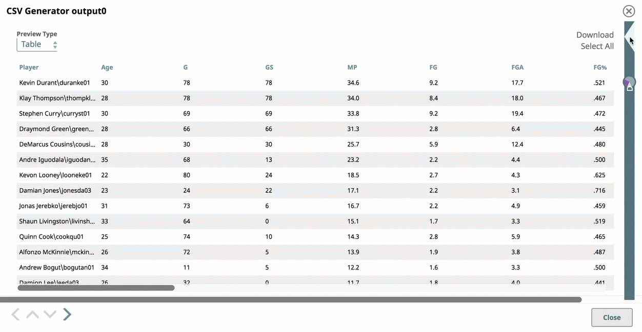
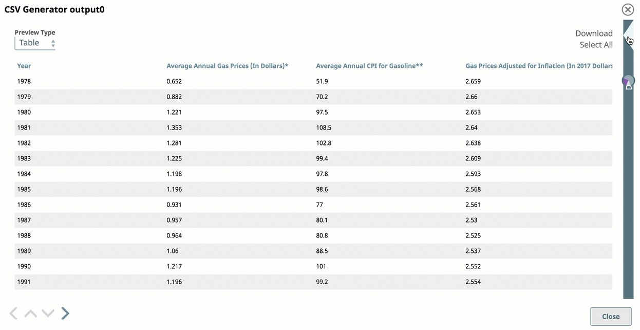
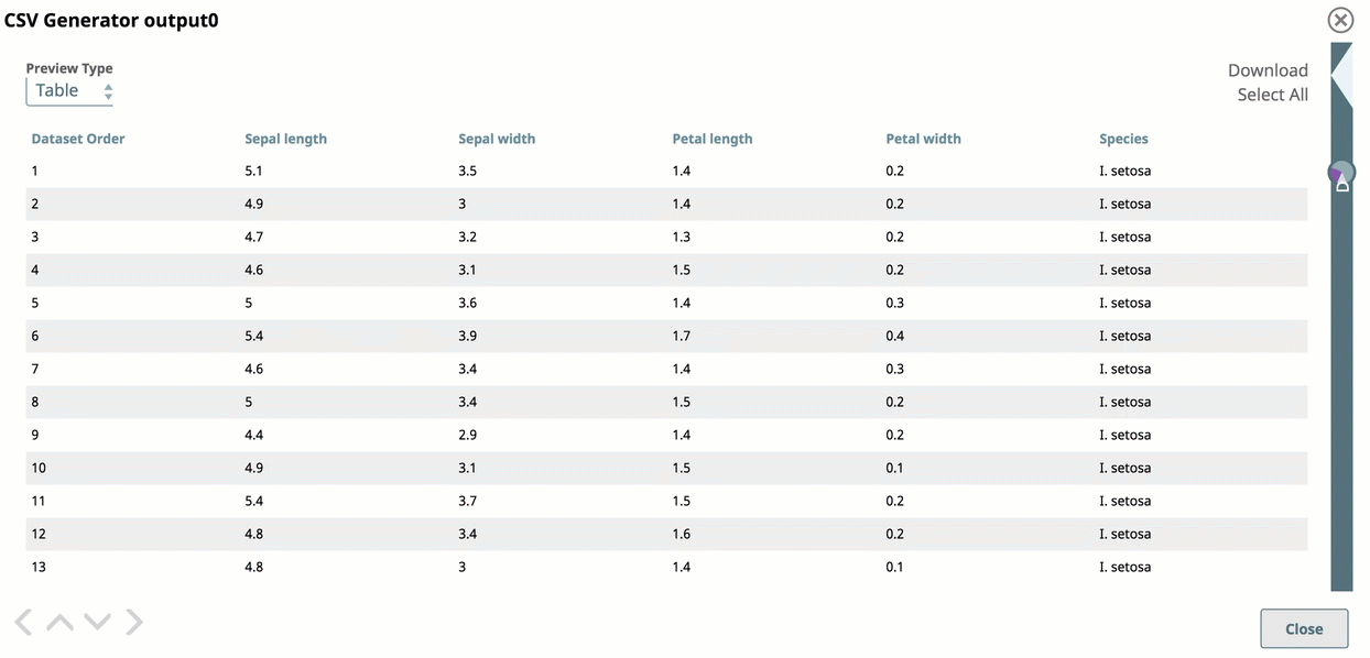
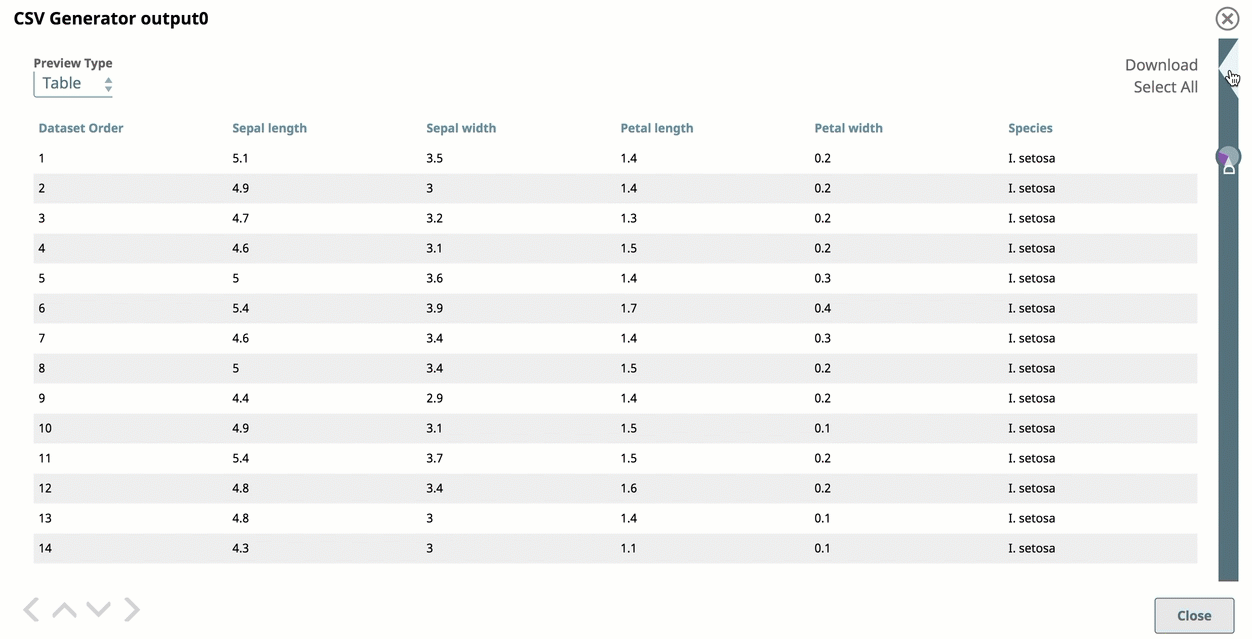
Preview Type: Select the Preview Type of JSON, Table, or Raw to view the data in JSON format, as a table (default), or as raw data.
Navigation: Click the inner arrow keys to navigate through the records, and click the outer arrow keys to navigate through the Data Preview of each Snap in the Pipeline.
Formatted: Select to add line feeds that improve the readability of data in table or JSON format. For example, when viewing error documents that have a stack trace column in JSON mode, select Formatted to make troubleshooting easier.
Download: Click Select All and Download to download the entire data set as a JSON file.
Arrows: navigate Navigate to the results for the next or the previous Snap.
...
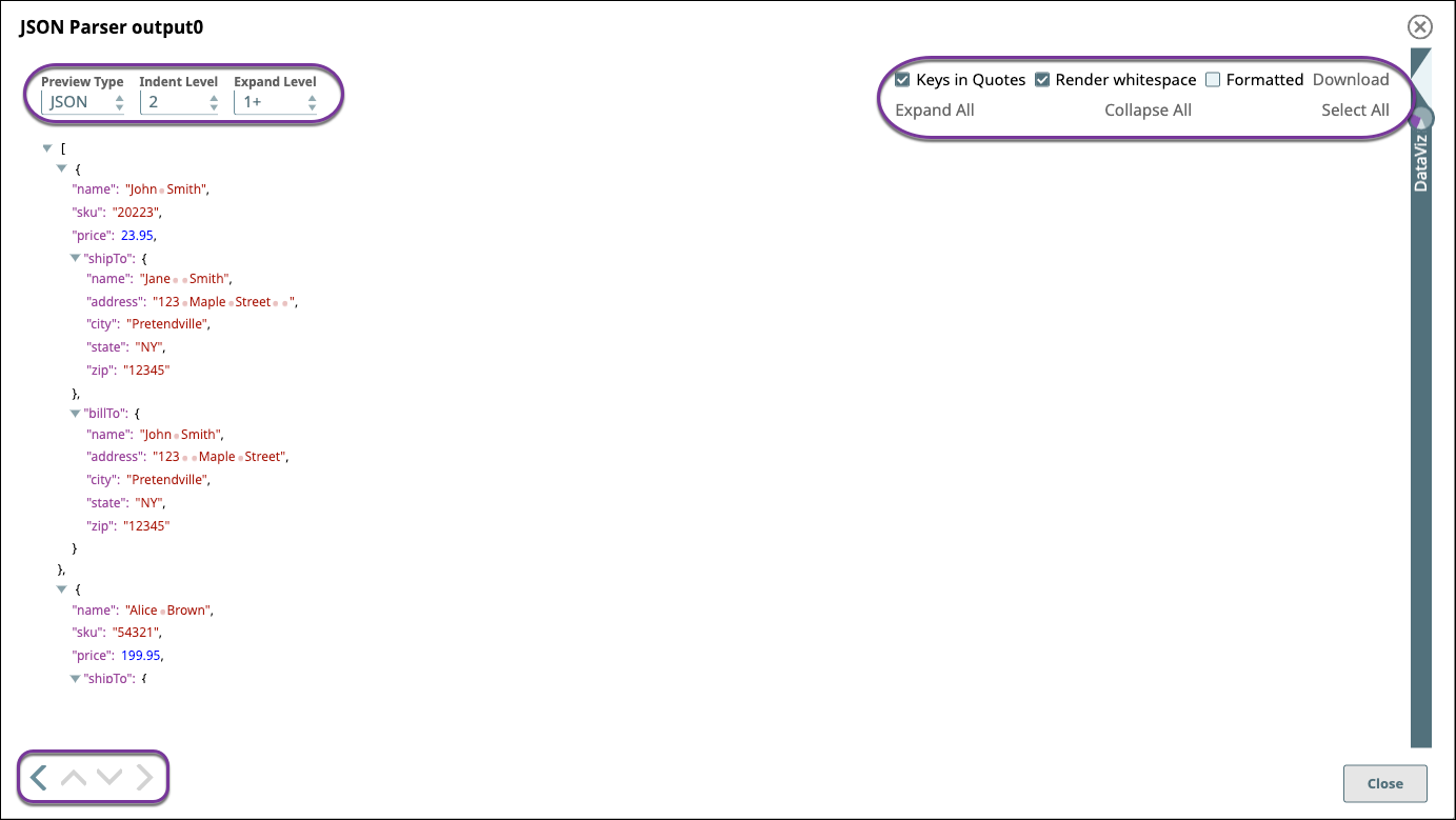
Preview Type: Select the Preview Type of JSON, Table, or Raw to view the data in JSON format, as a table (default), or as raw data.
Indent Level: Select the number of spaces to display indenting the hierarchical JSON elements.
Expand Level: Select the level of JSON elements to display.
Keys in Quotes: Select to add quotes in the display to key elements.
Render whitespace: Select to render blank spaces as symbols in the output. Each space is rendered as a dot (“.”) and each tab is rendered as an underscore ( _ ).
Formatted: Select to add line feeds that improve the readability of data in table or JSON format. For example, when viewing error documents that have a stack trace column in JSON mode, select Formatted to make troubleshooting easier.
Download: Click Select All and Download to download the entire data set as a JSON file.
Expand All: Click to expand all levels of a hierarchical JSON file.
Collapse All: Click to collapse all levels of a hierarchical JSON file.
Select All: Click to select the JSON text for copying and pasting.
Arrows: navigate Navigate to the results for the next or the previous Snap.
...