...
To change the number of records:
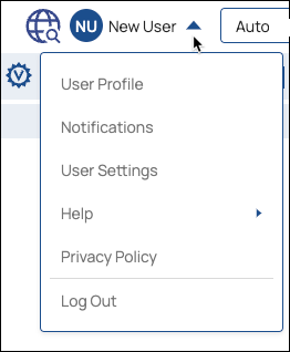
In
...
the IIP, click the dropdown next to your username to open the menu:
Select User Settings
...
to
...
open the Settings dialog:
...
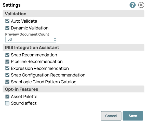
In the Settings dialog, click the Preview
...
Document Count drop-down menu, and choose from the available values.
...
Click Save.
Using DataViz
Save or validate a Pipeline, and open Data Preview for a Snap. Click DataViz and drag the cursor to the left or click the triangle at the top of the DataViz bar to display chart options:
...
To display preview data in a pie chart:
Open Data Preview for a Snap.
Click the triangle at the top of the DataViz bar.
For Chart Type, select Pie Chart.
Click Key to Visualize and choose the key for the values to represent in a pie chart.
| Anchor | ||||
|---|---|---|---|---|
|
...
To display data in a line chart for a given state:
Open Data Preview for a Snap.
Click the triangle at the top of the DataViz bar.
For Chart Type, select Line Chart.
Click Key to Visualize.
For each line, select a numeric field key.
| Anchor | ||||
|---|---|---|---|---|
|
To display data in a line chart with the date as the x-axis:
Open Data Preview for a Snap.
Click the triangle at the top of the DataViz bar.
For Chart Type, select Line Chart - Date as X axis.
For X-axis (date), select a temporal field (year, date, or time).
Click Key to Visualize.
Select the key for the y-axis values.
| Anchor | ||||
|---|---|---|---|---|
|
...
To display preview data in a bar chart by numeric values:
Open Data Preview for a Snap.
Click the triangle at the top of the DataViz bar.
For Chart Type, select Bar Chart - Count.
Click Key to Visualize.
Select the key field for the y-axis.
| Anchor | ||||
|---|---|---|---|---|
|
With an aggregated bar chart, the y-axis displays the numeric value and the x-axis groups the bars by category. To display your data in a bar chart by group and by count:
Open Data Preview for a Snap.
Click the triangle at the top of the DataViz bar.
For Chart Type, select Bar Chart - Group and Count.
For Category, select the target type.
For Group by, select the field to aggregate.
Roll your cursor over the bars to display a range of the values per each category for the indexical relationship between the group key value and the number of entries for that value.
| Anchor | ||||
|---|---|---|---|---|
|
To display two fields of data in a scatter chart and aggregate by a third category:
Open Data Preview for a Snap.
Select Scatter Chart as the Chart Type.
Select a data category from the X-Axis and Y-axis drop-down menus.
Optionally, select a data category from the Group By menu.
Roll over or click a data point to view values. The header shows the value for the Group by field, and the X- and Y- axis values appear below, separated by a comma.
...
Data Preview Reference
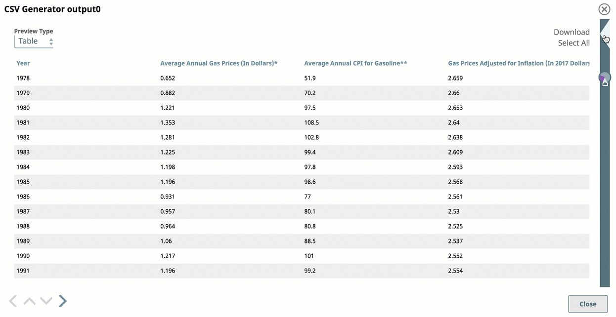
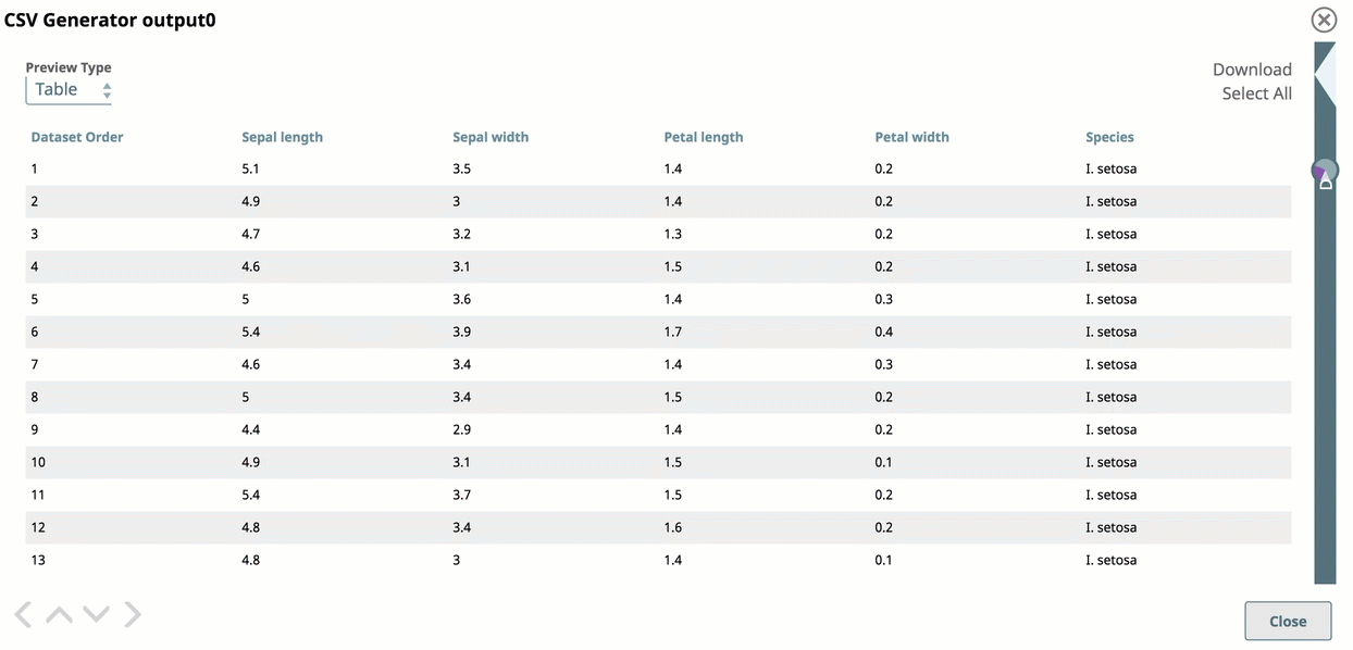
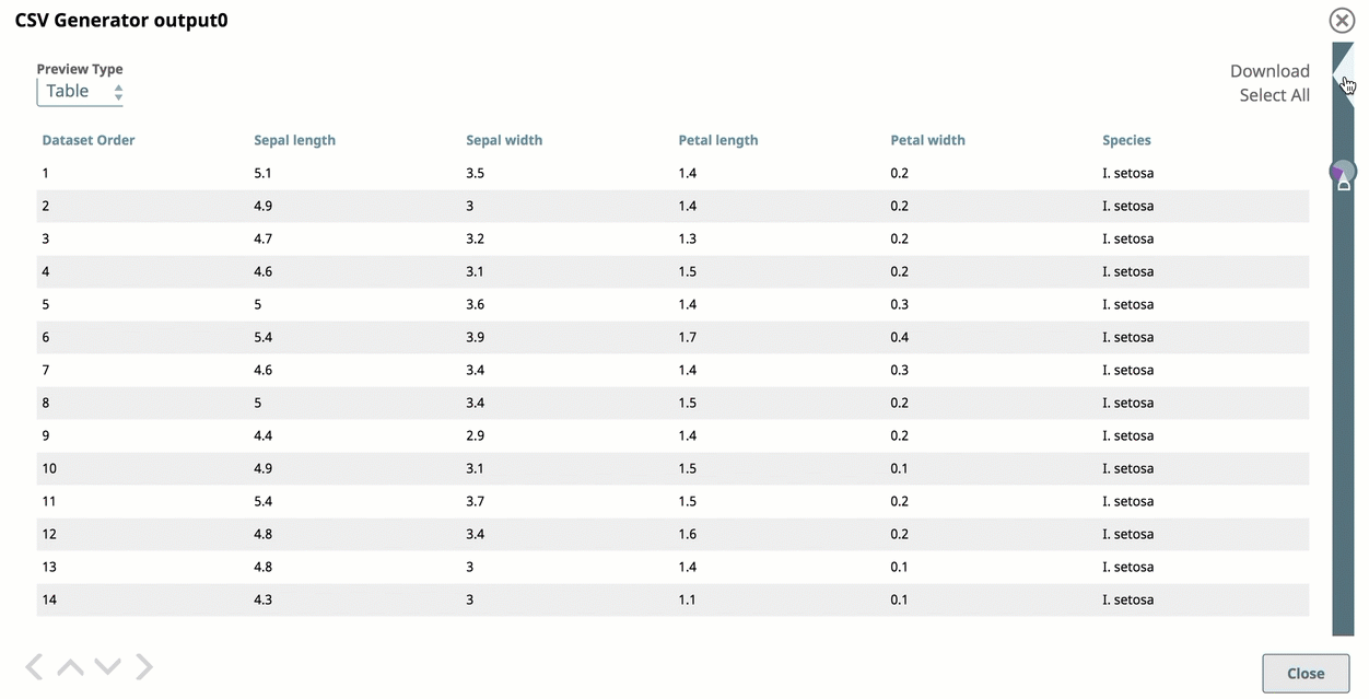
Data Preview displays by default in a standard table with infinite scrolling capabilities.
...