...
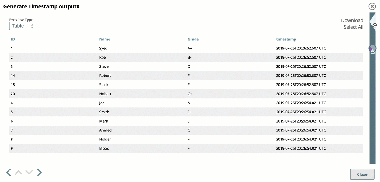
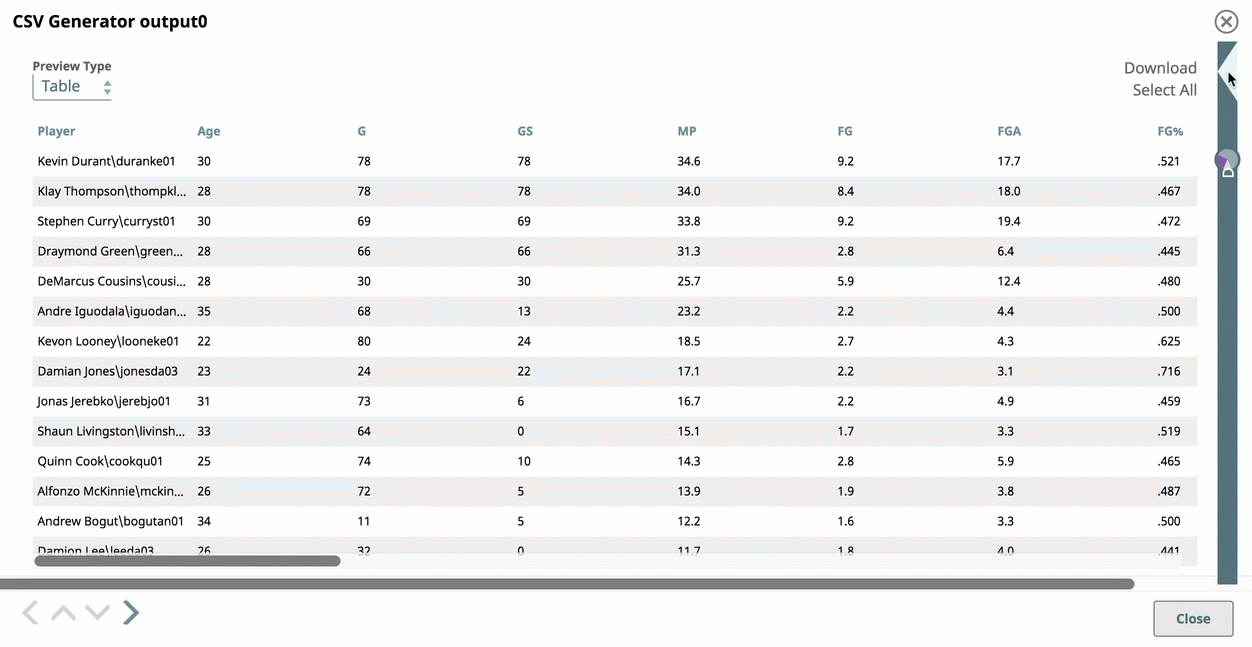
Data Preview helps you confirm that mapping and transformations are working as expected. At design time, when you save or validate a Pipeline, SnapLogic attempts to pass sample a sampling of the real data through all of the Snaps. You can preview the sample data output from any Snap that executed successfully and navigate through all Data Previews in the Pipeline. You can also preview the sample data from failed Snaps that output error documents.
SnapLogic encrypts the sample data before storing it to use in Data Preview. By default, the sample data includes the first 50 records from the input source, up to 15 MB in total size. If the number of documents to preview exceeds 15 MB, validation causes an error. You Org admins can change the Org-wide setting for the number of documents to preview, as long as the sample size is under the 15 MB limitpreview documents in Admin Manager or disable pipeline validation. If not disabled, users can change the number of preview documents at the Project level in their User Settings, up to the value set by the Org admin in Admin Manager.
The Data Preview opens in a table. You can display it in JSON format or raw, unformatted. You can also use DataViz to render specific fields of preview data in the following visualizations:
...
To change the number of records:
In
...
the IIP, click the dropdown next to your username to open the menu:
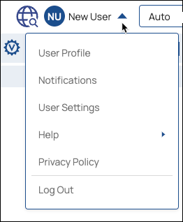
Select User Settings
...
to
...
open the Settings dialog:
...
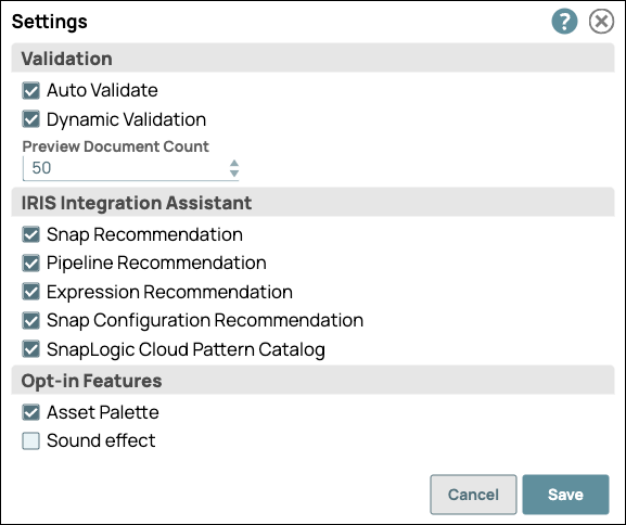
In the Settings dialog, click the Preview
...
Document Count drop-down menu, and choose from the available values.
...
Click Save.
Using DataViz
Save or validate a Pipeline, and open Data Preview for a Snap. Click DataViz and drag the cursor to the left or click the triangle at the top of the DataViz bar to display chart options:
...
To display preview data in a pie chart:
Open Data Preview for a Snap.
Click the triangle at the top of the DataViz bar.
For Chart Type, select Pie Chart.
Click Key to Visualize and choose the key for the values to represent in a pie chart.
| Anchor | ||||
|---|---|---|---|---|
|
...
To display data in a line chart for a given state:
Open Data Preview for a Snap.
Click the triangle at the top of the DataViz bar.
For Chart Type, select Line Chart.
Click Key to Visualize.
For each line, select a numeric field key.
| Anchor | ||||
|---|---|---|---|---|
|
To display data in a line chart with the date as the x-axis:
Open Data Preview for a Snap.
Click the triangle at the top of the DataViz bar.
For Chart Type, select Line Chart - Date as X axis.
For X-axis (date), select a temporal field (year, date, or time).
Click Key to Visualize.
Select the key for the y-axis values.
| Anchor | ||||
|---|---|---|---|---|
|
...
To display preview data in a bar chart by numeric values:
Open Data Preview for a Snap.
Click the triangle at the top of the DataViz bar.
For Chart Type, select Bar Chart - Count.
Click Key to Visualize.
Select the key field for the y-axis.
| Anchor | ||||
|---|---|---|---|---|
|
With an aggregated bar chart, the y-axis displays the numeric value and the x-axis groups the bars by category. To display your data in a bar chart by group and by count:
Open Data Preview for a Snap.
Click the triangle at the top of the DataViz bar.
For Chart Type, select Bar Chart - Group and Count.
For Category, select the target type.
For Group by, select the field to aggregate.
Roll your cursor over the bars to display a range of the values per each category for the indexical relationship between the group key value and the number of entries for that value.
| Anchor | ||||
|---|---|---|---|---|
|
To display two fields of data in a scatter chart and aggregate by a third category:
Open Data Preview for a Snap.
Select Scatter Chart as the Chart Type.
Select a data category from the X-Axis and Y-axis drop-down menus.
Optionally, select a data category from the Group By menu.
Roll over or click a data point to view values. The header shows the value for the Group by field, and the X- and Y- axis values appear below, separated by a comma.
...
Data Preview Reference
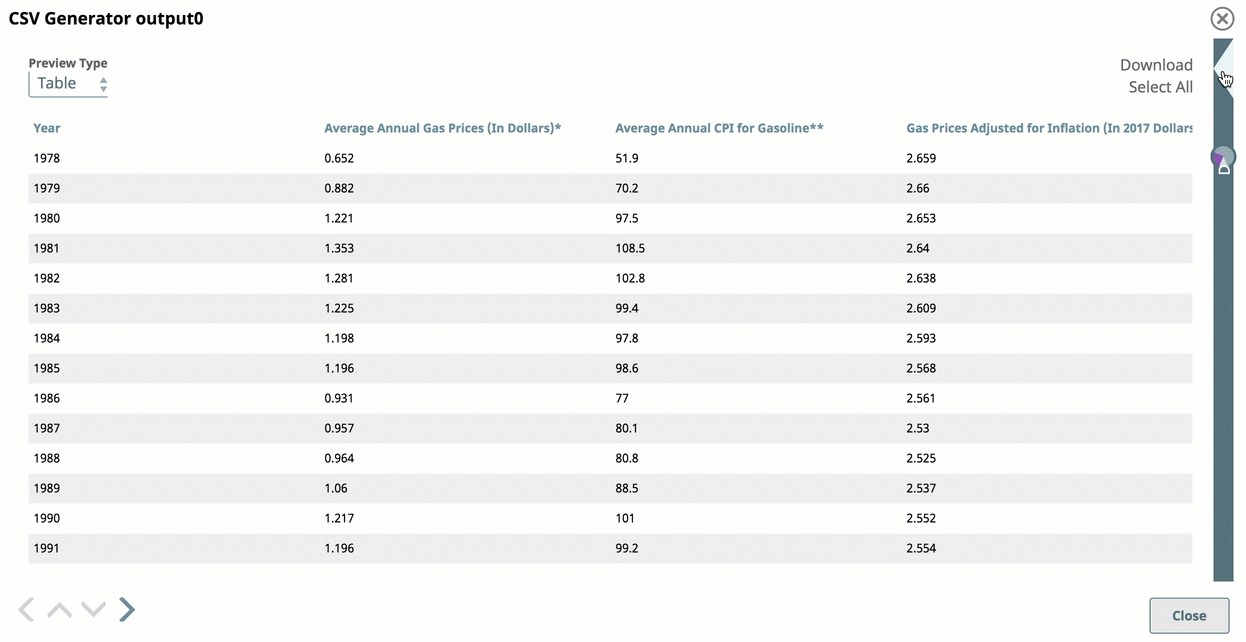
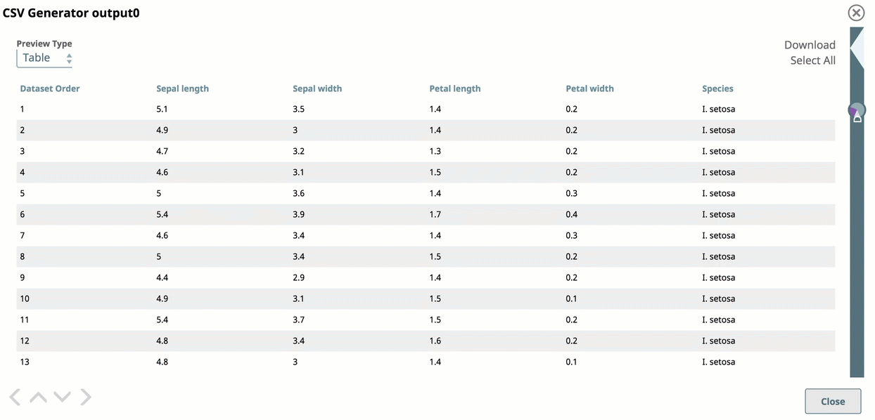
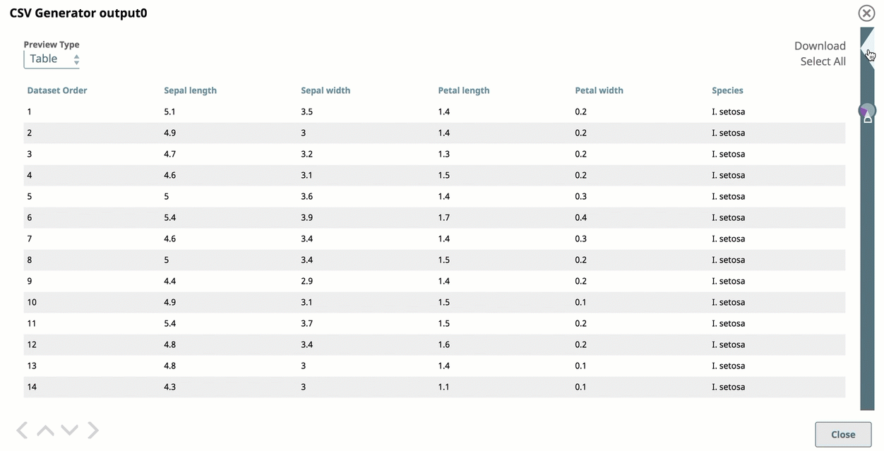
Data Preview displays by default in a standard table with infinite scrolling capabilities.
...