In this Section
On this Page
Overview
Snaps are the building blocks of a Pipelinea pipeline. Each Snap performs a performs a single function, such as read, writeparse, transform or update write data. You You can view the Snaps available to you (or your account) in the Snap the Snaps Catalog, on the left-hand side of the SnapLogic Designer. You You can drag a Snap from the Snap Catalog on to the Canvas to the Snap Catalog onto the Canvas to use it in a Pipeline.
By default, the Snap Catalog contains a Catalog contains a set of core Snaps available to Snaps available to all users. You can add premium or custom Snaps by installing them in Manager on the project-level Snap Packs page.
| Info |
|---|
|
The Snap Settings Popup
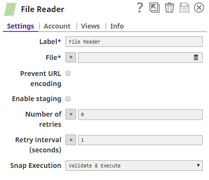
Once a Snap is on the Canvas, click on the Snap to open the Snap popup. The Snap popup enables you to configure the various settings associated with the Snap. To hide the popup, click on the Snap again, or click the  icon. Most Snap popups have some–or all–of the tabs listed in the table below. For illustration, we have taken the File Reader Snap as an example.
Use the Settings tab to configure the Snap.
For detailed information on configuring a specific Snap, click the  icon on the Snap Settings popup.
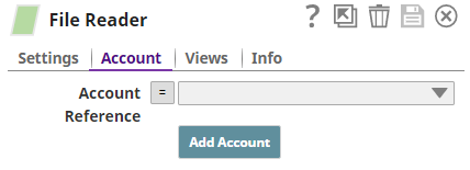
Use the Account tab to create and store the account details that the Snap will need to access external resources that need authorization.
Refer to Accounts and the individual Snap account documentation for details.
Use the Views tab to configure the input, output, and error views of the Snap.
See Configuring Snap Views for more information.

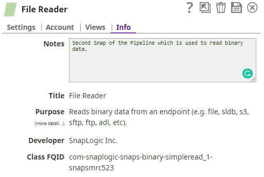
Use the Info tab to add notes to the Snap. These notes can help other users understand the role of the Snap in the Pipeline.
The Info tab also displays the Title, Purpose, Developer, and Class FQID (fully-qualified ID of the class that contains the Snap's functionality).
Icons in a Snap Popup
Snap popups typically display the following icons:


| bgColor | #ebf7e1 |
|---|---|
| borderStyle | solid |
|
| Child pages (Children Display) | ||
|---|---|---|
|