Overview
The Insights dashboard offers interactive charts that help you visualize Org-level Pipeline-execution statistics for a specific date range. The Insights dashboard also displays data visualization of assets that are used in your Org for a specific period.
You can customize the dashboard to only display the information that you need. You can also download CSV files of all the statistics.
- Only Org administrators can view the Insights dashboard. It is available only on the Production server and not on the UAT server.
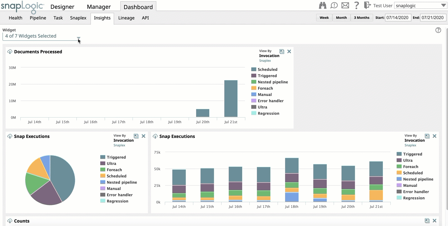
- Starting in the 4.23 Release, SnapLogic Dashboards provide multiple widgets instead of tiles as the UI display medium for monitoring metrics. Widgets refer to the specific interactive area charts where you can monitor a specific metric. You can choose which widgets display on a Dashboard by using the selector menu.
Viewing Insights Dashboard
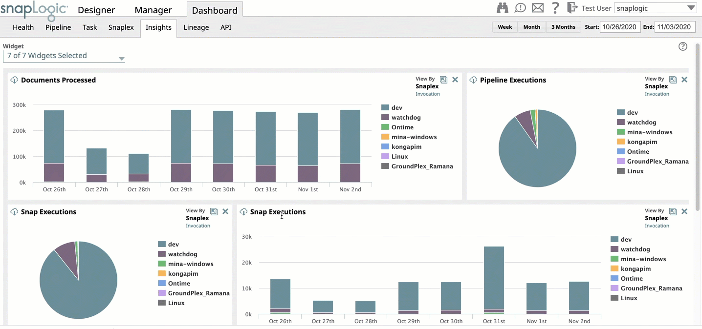
To view the Insights dashboard, click Dashboard > Insights. By default, SnapLogic displays data for a week.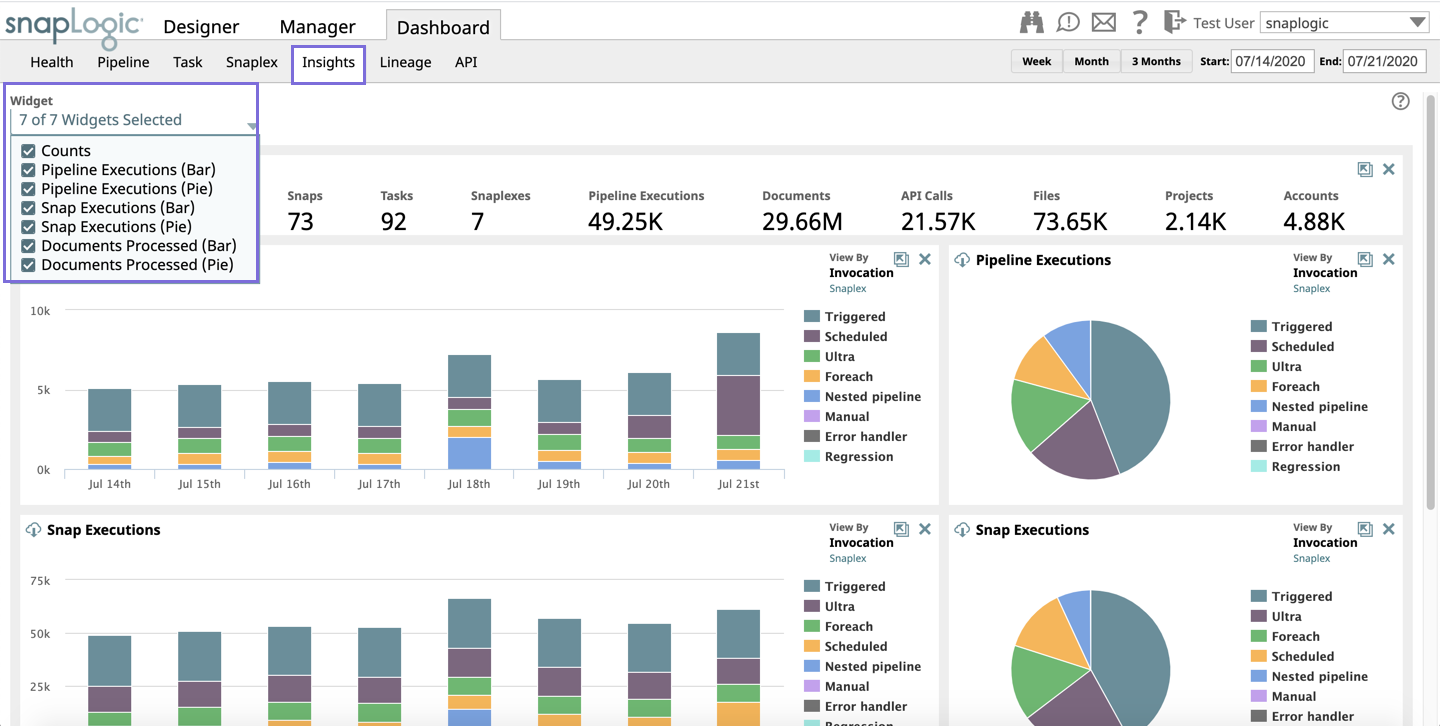
The dashboard displays bar and/or pie charts for the following:
- Pipeline Executions: The number of Pipelines executed in your Org during the specified window of time.
- Snap Executions: The number of Snaps executed in your Org during the specified window of time.
- Documents Processed: The total number of documents processed by the Snaps in executing Pipelines during the specified window of time.
- Bytes per Snap: The number of bytes processed by each Snap type in your Org during the specified window of time.
The Counts panel displays the total count of the following SnapLogic Assets associated with your Org:
- Pipelines: The number of Pipelines executed in your Org during the specified window of time.
- Users The number of users logged in during the specified window of time.
- Snaps: The number of Snaps in Pipeline executions during the specified window of time.
- Tasks: The number of Tasks executed in your Org during the specified window of time.
- Snaplexes: The number of active Snaplexes during the specified window of time.
- Pipeline Executions: The number of Pipelines executed in your Org during the specified window of time.
- Documents: The number of documents processed during the specified window of time.
- API calls: The number of API calls made during the specified window of time.
- Files: The number of files referenced by executing Pipelines during the specified window of time.
- Projects: The number of Projects referenced by executing Pipelines during the specified window of time.
- Accounts: The number of accounts referenced by executing Pipelines during the specified window of time.
- You can hover on any graph to view the statistics for each metric.
- Click on
 on the top left corner of each panel to download the statistics as a CSV file.
Customizing the Dashboard View
You can customize the Insights Dashboard to view data for a different date range, change the layout, view/hide the available panels, select the view type, and view details of a selected dimension only. The following subsections describe how you can customize the dashboard.
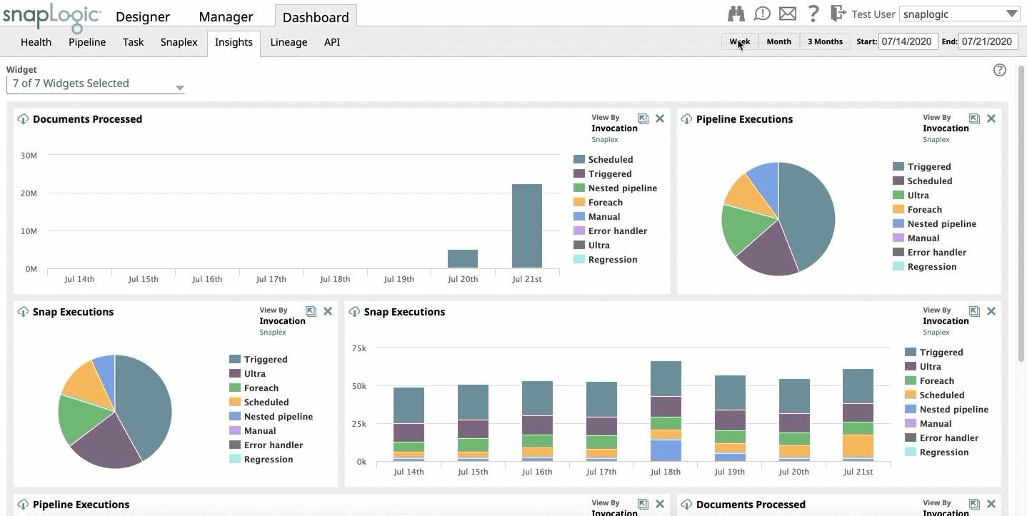
Selecting a Date Range
When you access the Insights dashboard, you can see the execution statistics for a week. However, you also have the option to specify your own time range by selecting one of the date range options in the top right corner of the dashboard. Click any one of the following options to change the time range:
- Week: View the execution statistics for the last seven days, starting from the current date.
- Month: View the execution statistics for the last one Month, starting from the current date.
- 3 Months: View the execution statistics for the last 3 Months, starting from the current date.
Start and End date: View the execution statistics for the Start and End date you specify. You can select the start and end dates by clicking on the Calendar drop-down and selecting the dates on the calendar. The start date can go back to a maximum of one year from the current date.
Viewing/hiding Panels
You can customize the dashboard to view the execution statistics for only your preferred chart panels. By default, the dashboard displays the statistics for all charts.
You can view or hide any number of the available panels.
To remove charts, click the Widget selector on the top left side of the dashboard, and deselect the target reports.
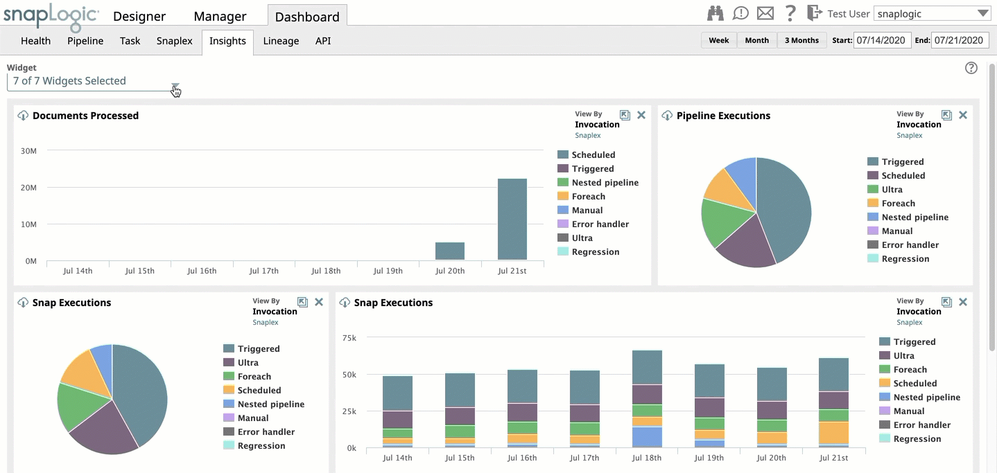
To add charts, click the Widget selector on the top left side of the dashboard, and select the target reports.
Selecting the View Type
You can select to view the charts either by clicking the Invocation Type or Snaplex. The dashboard displays statistics for the following methods of invocation:
- Nested Pipeline
- Scheduled Task
- Triggered Task
- Always on (Ultra Pipelines)
- For Each Snap
- Error Handler
For a Snaplex, the dashboard displays the statistics for all the Snaplex instances in your Org.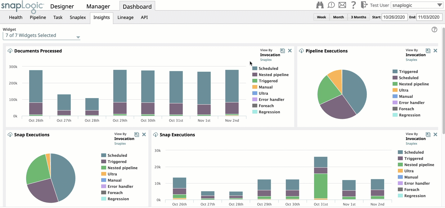
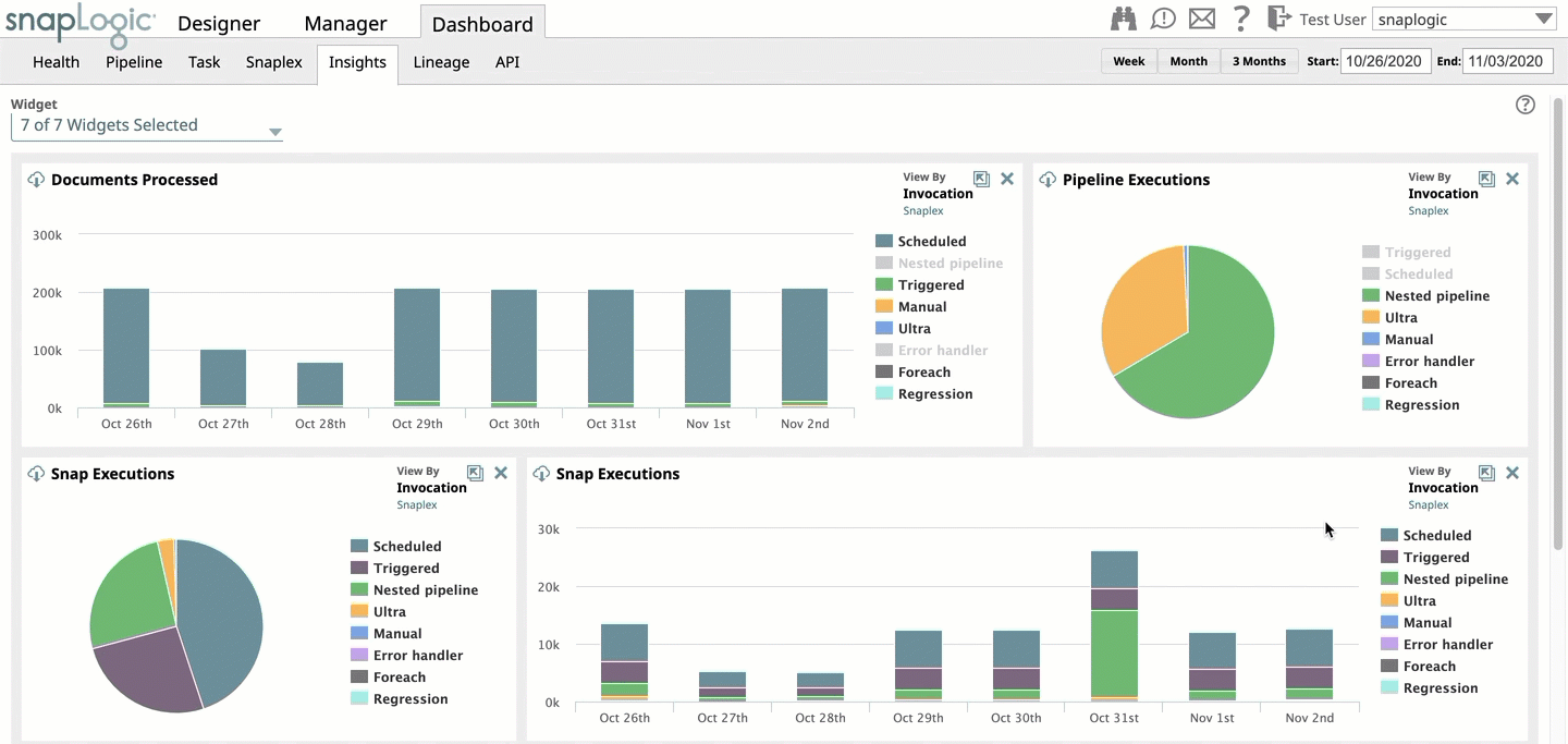
Viewing details of selected dimensions
For each chart, you can select or deselect the dimensions that the chart displays. For example, in Pipeline Executions chart and Invocation Type view, you can select or deselect one or more dimensions like Scheduled, Foreach, Nested Pipelines. The statistics are displayed only for the selected dimensions.
To remove a dimension, click on the dimension name next to the chart. The dimension name is disabled and the chart only displays statistics for the rest of the dimensions.
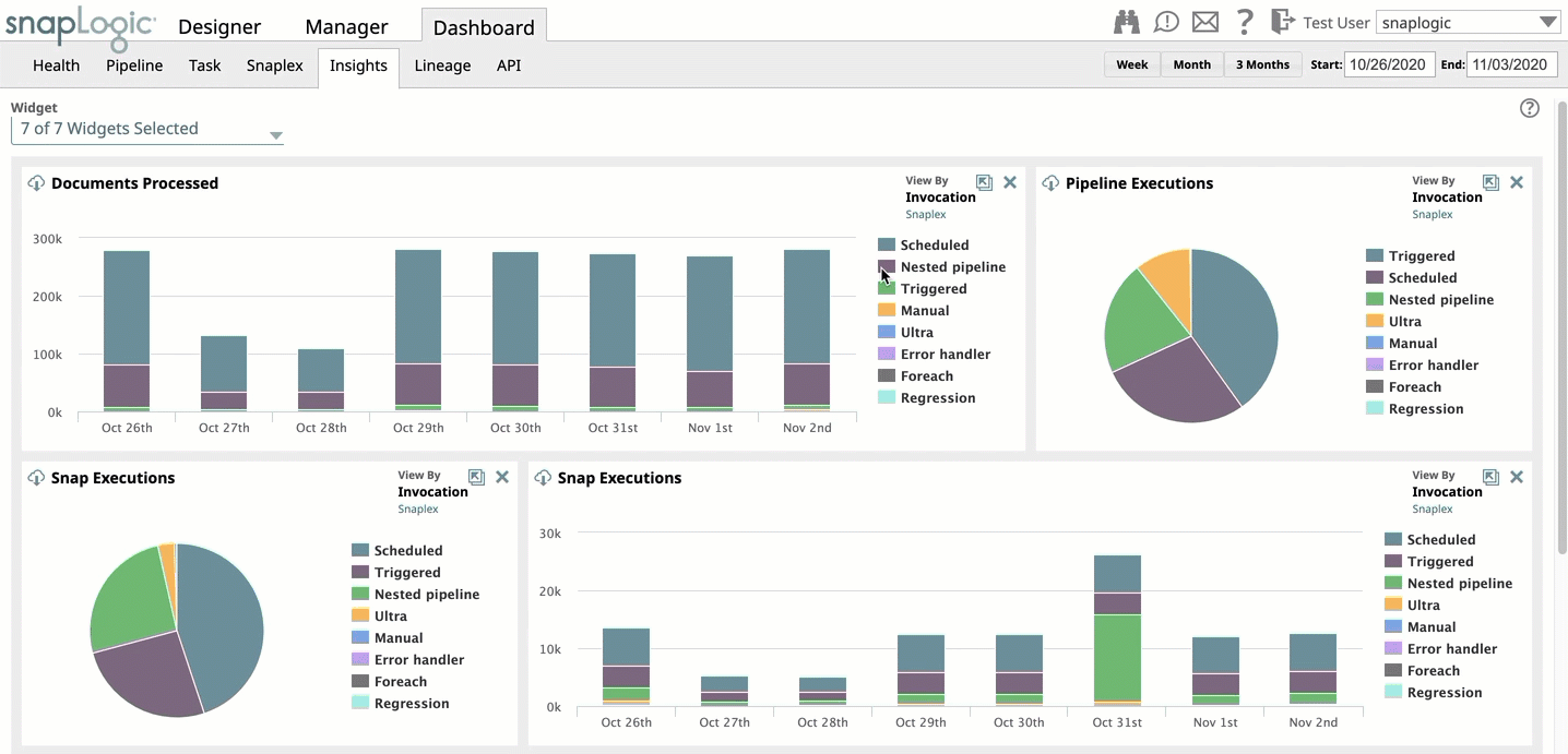
To add a dimension, click on the disabled dimension name next to the chart. The dimension name is enabled and the chart displays statistics for the enabled dimensions also.
Changing the Dashboard Layout
You can customize the dashboard layout by dragging the panels and dropping them at the desired location on the dashboard. You can even delete panels.