On this Page
| Table of Contents | ||||
|---|---|---|---|---|
|
Overview
Data Preview
...
If you want to disconnect the Snaps instead of displaying the data preview, position the cursor over the connection from the adjoining Snap.
Data Preview Guidelines
...
helps you confirm that mapping and transformations are working as expected. At design time, when you save or validate a Pipeline, SnapLogic attempts to pass a sampling of the real data through all of the Snaps. You can preview the sample data output from any Snap that executed successfully and navigate through all Data Previews in the Pipeline. You can also preview the sample data from failed Snaps that output error documents.
SnapLogic encrypts the sample data before storing it to use in Data Preview. By default, the sample data includes the first 50 records from the input source, up to 15 MB in total size. If the number of documents to preview exceeds 15 MB, validation causes an error. Org admins can change the Org-wide setting for the number of preview documents in Admin Manager or disable pipeline validation. If not disabled, users can change the number of preview documents at the Project level in their User Settings, up to the value set by the Org admin in Admin Manager.
The Data Preview opens in a table. You can display it in JSON format or raw, unformatted. You can also use DataViz to render specific fields of preview data in the following visualizations:
Pie chart - Organizes data in sectors, where each sector represents a group proportionate to the whole.
Line chart - Compares trends visually for multiple fields or a single field over time.
Bar chart - Compares a category from a data set, similar to a pie chart. The simple bar chart displays the number of instances for a field. The group and count bar chart compares data sets from two categories against an index, such as time or geographical location.
Scatter chart - Plots the data set for two fields as a map of coordinates and optionally aggregates the data by a third category.
Limitations with Numbers in Data Preview
In preview data, number fields do not always display the expected values:
JavaScript has limitations in displaying numbers. The actual value is maintained in the data
...
; however, the preview might not display the numbers accurately. For example:
Numbers greater than the JavaScript constant
Number.MAX_VALUEdisplay asInfinity. Learn more about MAX_VALUE.Integers greater than the JavaScript constant
Number.MAX_SAFE_INTEGERmight be rounded or otherwise displayed incorrectly. Learn more about MAX_SAFE_INTEGER.
Numbers without significant fractional values are displayed as integers. For example:
10.00is displayed as10.
Previewing Data
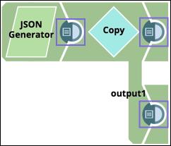
After saving or validating a Pipeline, preview the data that a Snap will pass down the Pipeline using the data preview icon ![]() in the connector on the right side of the Snap:
in the connector on the right side of the Snap:
...
Open the Data Preview in one of the following ways:
On Windows, click the data preview icon.
On MacOS, double-click the data preview icon.
| Info |
|---|
To disconnect a Snap instead of displaying the data preview, position the cursor over the connection from the adjoining Snap. |
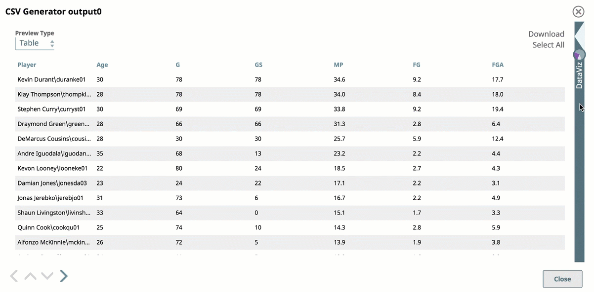
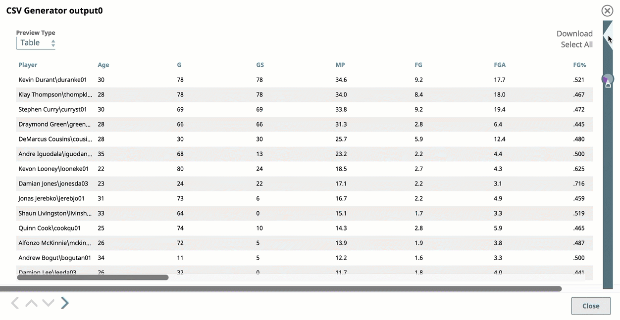
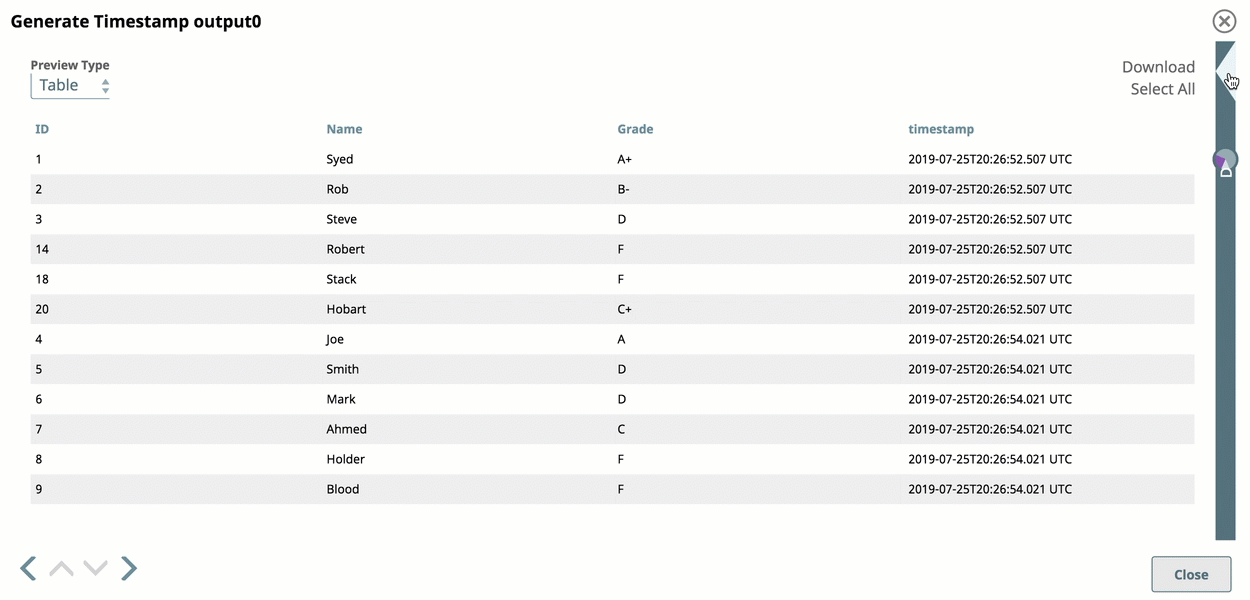
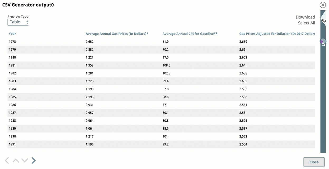
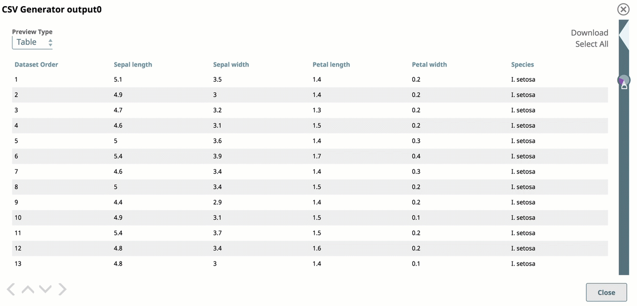
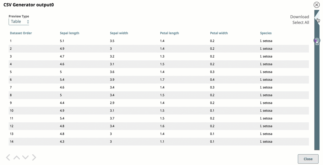
By default, the data preview displays as a table. The Data Preview for some Snaps, such as file readers, displays the metadata instead of data values. The following example shows preview data values after passing through an Excel Parser Snap:
...
Use the controls on the Data Preview pane to:
Switch the data format to JSON or raw
Display preview document data formatted with line feeds
Download the preview data
Open DataViz to generate a chart from the preview data
Navigate through the preview data
Move to the Preview Data pane for the next or previous Snap
Navigating through Snap Data Previews
Use the outer arrows at the bottom left of the data preview to navigate to the results for the next or the previous Snap:
...
Viewing data in error documents
If a Snap fails to execute, you can preview data from the previous Snap error documents:
...
Setting the Number of Records to Preview
You can change the number of records to be
...
shown in the Data Preview, up to a total size of 15 MB. Depending on the size of individual records, increasing the number can provide better visualization.
To change the number of records:
In
...
the IIP, click the dropdown next to your username to open the menu:
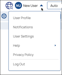
Select User Settings to open the Settings dialog:
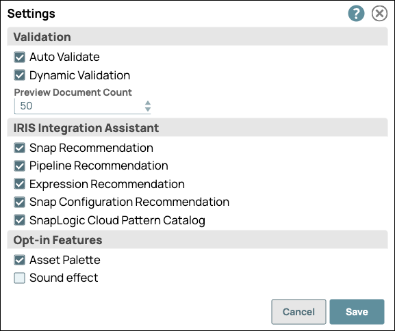
In the Settings dialog, click the Preview
...
Document Count drop-down menu,
...
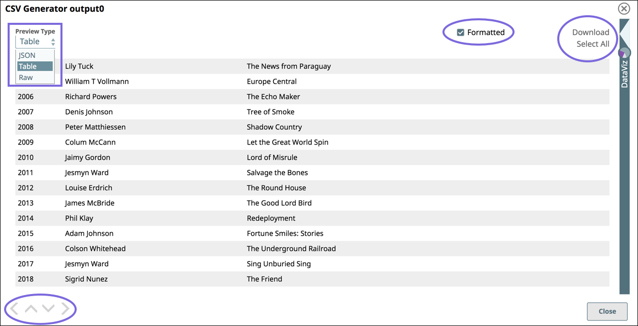
Tabular View
You can view your data arranged in a standard table with infinite scrolling capabilities. As you scroll further past the first set of displayed rows, more data is uploaded.
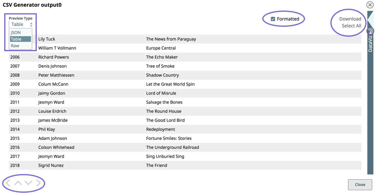
Preview Type: Select the Preview Type as JSON, Table, or Raw to view the data in JSON format, as a Table (default), or as Raw Data.
Navigation: Click the inner arrow keys to navigate through the records, and click the outer arrow keys to navigate through the Data Preview of each Snap in the Pipeline.
Formatted: Select to format document data with line-feeds. Doing so increases the readability of the data in table/JSON modes. For example, when viewing error documents that have a stack trace column in JSON/table mode, you can select Formatted to view this information easier.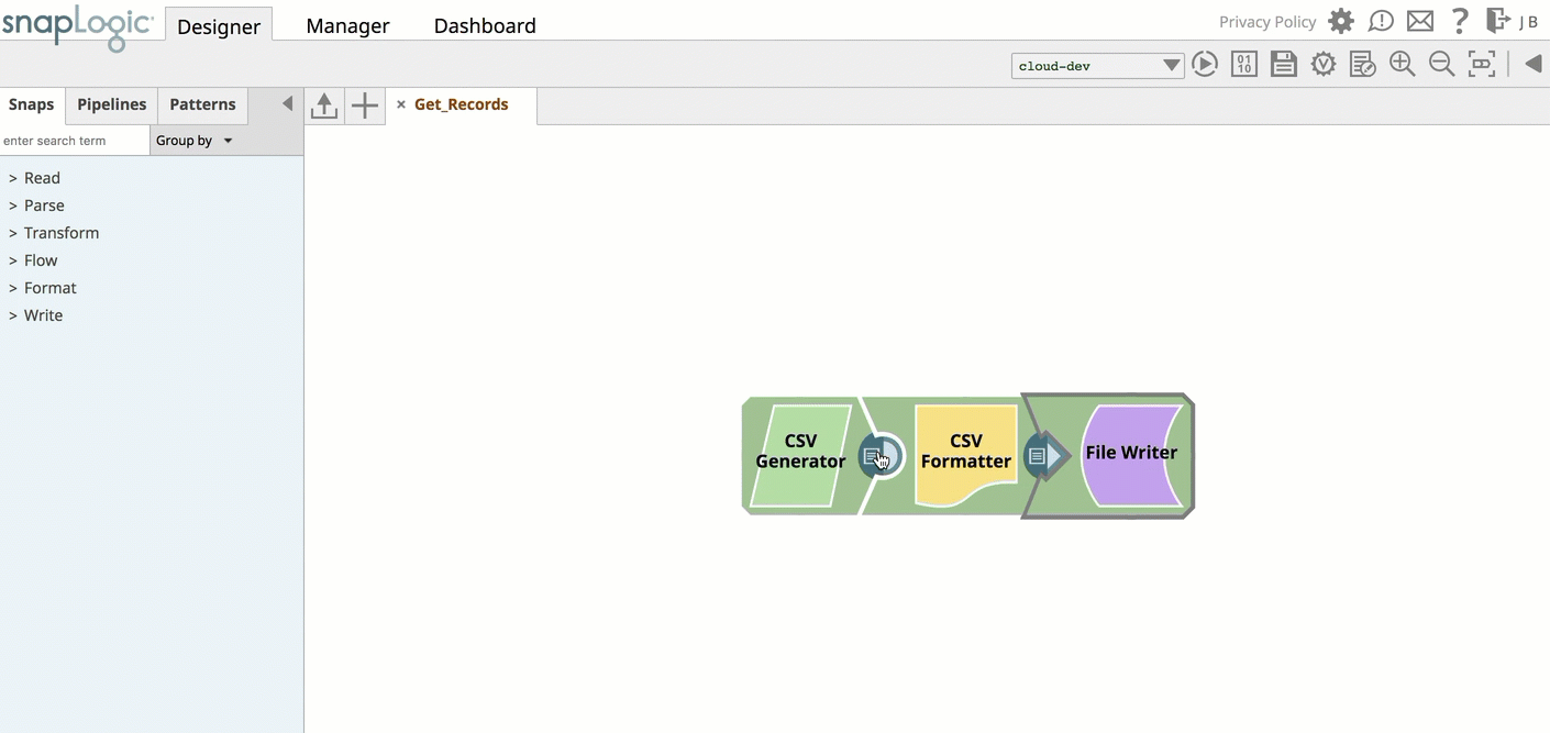
Download: Click Select All and Download to download the entire data set as a JSON file.
Data Visualization
...
and choose from the available values.
Click Save.
Using DataViz
Save or validate a Pipeline, and open Data Preview for a Snap. Click DataViz and drag the cursor to the left or click the triangle at the top of the DataViz bar to display
...
The visualization is of all the records in the document, as opposed to the limited records that the tabular view provides. You can click Chart Type to select the following types:
- Pie chart
- Line chart
- Line Chart - Date as X Axis
- Bar Chart - Group and Count
- Bar chart - Count
- Scatter chart
| Note |
|---|
The visualization in the new Data Previewer does not work if you open the previewer before the Pipeline validation is complete. |
Pie Chart
A Pie Chart is an effective representation for visualizing data in sectors, where each sector represents a group proportionately to the whole.
To display your data in a Pie Chart:
- Select Pie Chart as the Chart Type
Select the Visualization Key menu and choose a data category.

Line Chart
A Line Chart is an effective representation to compare trends visually across multiple categories of data in a given state or time; it plots a series of data points connected by a line.
To display your data in a line chart:
- Select Line Chart as the Chart Type.
- Select Keys to Visualize.
Line Chart - Date as X Axis
A Line Chart is an effective representation to compare trends visually across multiple categories of data in a given state or time; it plots a series of data points connected by a line.
To display your data in a line chart with date as the x-axis:
...
chart options:
...
The following sections describe how to use DataViz to configure charts:
| Anchor | ||||
|---|---|---|---|---|
|
Pie charts reveal patterns by totaling the unique values in a field. Select a field that does not contain too many values. For example, selecting a Grade key, where there are only 16 possible values, makes a meaningful pie chart. However, selecting a Date key over three years of transactions would result in too many dates for the pie chart visualization to render the chart correctly.
| Tip |
|---|
If the field you choose to visualize contains too many unique values, the pie chart might fail to render. |
To display preview data in a pie chart:
Open Data Preview for a Snap.
Click the triangle at the top of the DataViz bar.
For Chart Type, select Pie Chart.
Click Key to Visualize and choose the key for the values to represent in a pie chart.
| Anchor | ||||
|---|---|---|---|---|
|
A line chart reveals data trends. DataViz can render preview data in a line chart:
| Anchor | ||||
|---|---|---|---|---|
|
To display data in a line chart for a given state:
Open Data Preview for a Snap.
Click the triangle at the top of the DataViz bar.
For Chart Type, select Line Chart.
Click Key to Visualize.
For each line, select a numeric field key.

| Anchor | ||||
|---|---|---|---|---|
|
To display data in a line chart with the date as the x-axis:
Open Data Preview for a Snap.
Click the triangle at the top of the DataViz bar.
For Chart Type, select Line Chart - Date as X axis.
For X-axis (date), select a temporal field (year, date, or time).
Click Key to Visualize.
Select the key for the
...
y-axis
...
Bar Chart - Group and Count
A bar chart is an effective representation for comparing data sets across two categories against an indexical data category, such as time or geographical location.
values.
| Anchor | ||||
|---|---|---|---|---|
|
DataViz provides two types of bar charts:
| Anchor | ||||
|---|---|---|---|---|
|
To display preview data in a bar chart by numeric values:
Open Data Preview for a Snap.
Click the triangle at the top of the DataViz bar.
For Chart Type, select Bar Chart - Count.
Click Key to Visualize.
Select the key field for the y-axis.

| Anchor | ||||
|---|---|---|---|---|
|
With an aggregated bar chart, the y-axis displays the numeric value and the x-axis groups the bars by category. To display your data in a bar chart by group and by count:
- Select Bar Chart as the Chart Type.
- Select a data category from Category.
- Select a data category from Group by.

...
Open Data Preview for a Snap.
Click the triangle at the top of the DataViz bar.
For Chart Type, select Bar Chart - Group and Count.
For Category, select the target type.
For Group by, select the field to aggregate.
Roll your cursor over the bars to display a range of the values per each category for the indexical relationship between the group key value and the number of entries for that value.
Bar Chart - Count
A simple bar chart is an effective representation for counting the number of instances within a category in a data set, similar to a pie chart.
To display your data in a bar chart:
- Select Bar Chart - Count as the Chart Type.
- Select a data category from Key to Visualize
Scatter Chart
A scatter chart is effective for visualizing your data set as a map of coordinates across three categories; it uses color-coding and shapes to help you easily discern the data categories that the coordinates represent.
To display your data in a scatter chart:
| Anchor | ||||
|---|---|---|---|---|
|
To display two fields of data in a scatter chart and aggregate by a third category:
Open Data Preview for a Snap.
Select Scatter Chart as the Chart Type.
Select a data category from the X-Axis and Y-axis drop-down menus.
...
Optionally, select a data category from the Group By menu.
...
Roll over or click a data point to view
...
values.
...
The header shows the value for the Group by field, and the X- and Y- axis values appear below, separated by a comma.
...
...
Data Preview Reference
Data Preview displays by default in a standard table with infinite scrolling capabilities.
Table Preview
Use the controls highlighted in the screenshot below as follows:
Preview Type: Select the Preview Type of JSON, Table, or Raw to view the data in JSON format, as a table (default), or as raw data.
Navigation: Click the inner arrow keys to navigate through the records, and click the outer arrow keys to navigate through the Data Preview of each Snap in the Pipeline.
Formatted: Select to add line feeds that improve the readability of data in table or JSON format. For example, when viewing error documents that have a stack trace column in JSON mode, select Formatted to make troubleshooting easier.
Download: Click Select All and Download to download the entire data set as a JSON file.
Arrows: Navigate to the results for the next or the previous Snap.
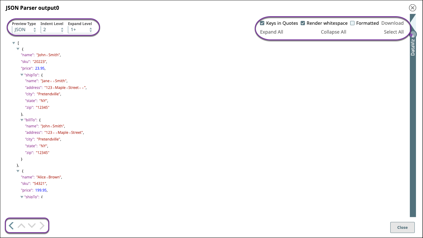
JSON Preview
If you change to JSON as the preview type, additional controls are available. Use the controls as follows:
Preview Type: Select the Preview Type of JSON, Table, or Raw to view the data in JSON format, as a table (default), or as raw data.
Indent Level: Select the number of spaces to display indenting the hierarchical JSON elements.
Expand Level: Select the level of JSON elements to display.
Keys in Quotes: Select to add quotes in the display to key elements.
Render text with whitespace: Renders blank spaces as dots "." and tabs as underscores "_" in the preview data.
Formatted: Select to add line feeds that improve the readability of data in table or JSON format. For example, when viewing error documents that have a stack trace column in JSON mode, select Formatted to make troubleshooting easier.
Download: Click Select All and Download to download the entire data set as a JSON file.
Expand All: Click to expand all levels of a hierarchical JSON file.
Collapse All: Click to collapse all levels of a hierarchical JSON file.
Select All: Click to select the JSON text for copying and pasting.
Arrows: Navigate to the results for the next or the previous Snap.
Data Preview Options Example
The following video demonstrates Data Preview configuration options:
...
Troubleshooting Data Preview
If you have issues with data preview, check the following:
If the data preview does not display or you get a validation error, check the User Settings and select fewer records to preview. Make sure the records do not total more than 15 MB in size. If changing the number of records does not work, check with your administrator to see if Pipeline Validation has been disabled at the Org level.
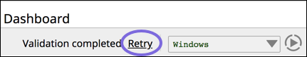
If the preview data is not exactly what you are expecting, the browser might be caching stale data. In the toolbar, click Retry:
...