Dashboard Snaplex Wall
In this article
Overview
The Snaplex wall enables you to monitor the resource utilization in your Snaplex. This data is helpful in visually analyzing and controlling resource utilization. Using the stacked area charts, you can monitor the resource load on your Snaplex over different time periods and gain an understanding of resource utilization over time.
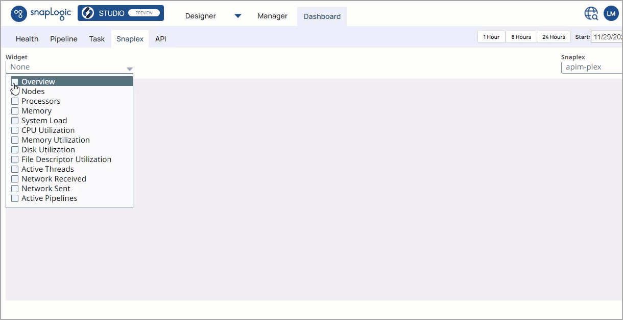
The SnapLogic Dashboard provides multiple widgets instead of tiles as the UI display medium for monitoring metrics. Widgets refer to the specific interactive area charts where you can monitor a specific metric. You can choose which widgets display on a Dashboard by using the selector menu.
Selecting a Widget
To view a specific report on the Snaplex dashboard wall, click the Widget selector dropdown, and select the area charts and reports to display on the dashboard wall.
Snaplex Metrics
Metrics Overview
The dashboard contains charts for key metrics and a summary report. The Overview report provides the metrics for key resource usage indicators for that Snaplex. 
You can view these metrics in the one of the two following views:
- Max: Select to use the maximum utilization.
- Average: Select to use the average utilization.
For every report, you can click ![]() to download the chart report.
to download the chart report.
Metric Charts
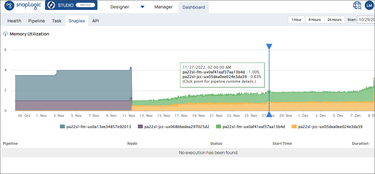
The line of each chart represents the Snaplex node over the specified time range. Charts display the data points for each node, with each data point representing the average value of that metric over a one minute interval. For time ranges more than 7 days, each data point represents the average value of that metric over a 15 minute interval instead. You can click on the node to display the metrics. Each data point represents the quantity or a percentage of utilization for the target Snaplex node.
- Nodes: The total number of JCC and FeedMaster nodes.
- System Load: The number of processes executing or waiting to execute.
- Processors: The number of vCPUs.
- Memory: Usable memory in GB.
- CPU Utilization: The percentage of the CPU utilization for each node, calculated as the amount of time spent not in the idle state.
- Memory Utilization: The percentage of the memory utilization for each node.
- Disk Utilization Area: The percentage of the disk utilization for each node.
- File Descriptor Utilization: The percentage of Open File Descriptor utilization for each node.
- Active Threads: The number of active threads for each node.
- Network Sent: The number of bytes (MBps) sent across the network for each node.
- Network Received: The number of bytes (MBps) received by the network for each node.
- Active Pipelines: The number of Pipelines executing in the specified time period for each node.
Interactive Widgets
You can now correlate data spikes in your Snaplex resources with the Pipeline executions. As multiple running Pipelines on a Snaplex increasingly use more resources, monitoring performance becomes paramount to maintaining production Pipelines. The performance of the Snaplex might suffer under too many, complex Pipelines, and to prevent a Snaplex node from failing, you can reassign a Pipeline to another Snaplex node or add more nodes.
With interactive widgets on the Snaplex dashboard, you can expand the widget and click on the data point to determine which Pipelines are causing the data spikes.
Correlating Pipelines with Data Spikes
- Click
 to expand one of the Snaplex monitoring widgets:
 - Click the target data spike to display a scrolling list of Pipelines running at that time.
Snaplex nodes are indicated below the graph.- Select or deselect the nodes removes or adds their details to the chart.
- Click the Pipelines to view it in Designer.
- Click
 to close the widget and return to the Snaplex tab view.
Report Details
- Pipelines: The name of the Pipeline.
- Node: The Snaplex node on which the Pipeline is running.
- Status: The status of the Pipeline execution at the time of the report
- Start Time: The time that the Pipeline execution started.
- Duration: The total time of the Pipeline execution.
- Documents: The number of documents processed by the Pipeline.
Selecting the Snaplex
To view the Snaplex dashboard, log into SnapLogic and go to the Dashboard > Snaplex subtab. From the Snaplex dropdown list, select the target Snaplex. By default, the Snaplex dashboard displays all the available metrics for the last hour.
Customizing the Dashboard View
You can customize the Snaplex dashboard to do the following:
Selecting a Time Range
When you access the Snaplex dashboard, you see the execution metrics for an hour. However, you have the option to specify a custom time range by selecting one of the time range options in the top right corner of the Dashboard. Click any one of the following options to change the time range:
- 1 Hour: View Snaplex metrics for the last hour, starting from the current time.
- 8 Hours: View Snaplex metrics for the last 8 hours, starting from the current time.
- 24 Hours: View Snaplex metrics for the last 24 hours, starting from the current time.
Start and End date: View the Snaplex metrics for the start and end date you specify. Enter your target dates in the Start and End date fields in the calendar dropdown and select the dates on the calendar. The start date can go back to a maximum of 45 days from the current date.
.gif?version=1&modificationDate=1671002439529&cacheVersion=1&api=v2&width=900&height=397)
Changing the Dashboard Layout
You can customize the Snaplex dashboard layout by dragging the panels and dropping them at the desired location on the Dashboard.
- Click
 in the top right corner of the chart to delete it from the Dashboard.
 - Click to expand the chart.
- Click
 to download the metric information as an .csv file.
.gif?version=1&modificationDate=1671003227669&cacheVersion=1&api=v2&width=900&height=405)
Have feedback? Email documentation@snaplogic.com | Ask a question in the SnapLogic Community
© 2017-2025 SnapLogic, Inc.